How to Choose a Color Palette for Art

I’m a self-taught artist who loves sharing tips and tutorials for painting with watercolor and gouache, and using the Procreate app on the iPad.
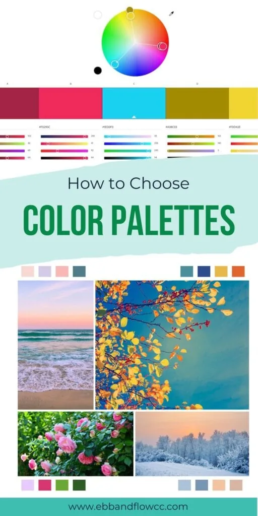
Get easy tips to choose a color palette for art. Selecting the colors for your art can be one of the more difficult decisions to make. Here’s how I make it easier.
You might also like this post on color theory.
This post contains affiliate links. By purchasing an item through an affiliate link, I earn a small commission at no extra cost to you. As an Amazon Associate I earn from qualifying purchases.
Sometimes it feels like choosing a color palette for art is the most challenging part of the process. It can be daunting, but it can also be really fun.
I’m sharing some of my favorite ways to create color palettes.
These concepts work for any medium. I’ve included a few that are app or program-specific, but they still work.
How to Choose a Color Palette for Art
Here are some things that I think about when considering a color palette for my art.
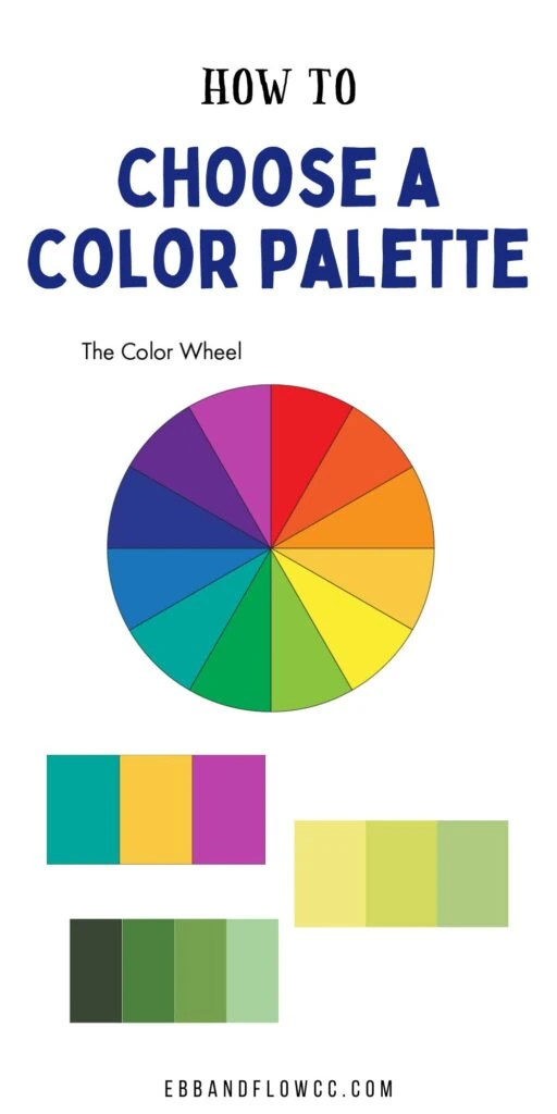
Basic Color Palettes
I covered much of this in my color theory post, but it’s worth discussing again. These color palettes are fine, but they are a bit basic.
To make them more interesting, don’t choose these color schemes at their full saturation. Look at pastels and muted tones instead.
(I kept the examples at full saturation for the sake of clarity, but I don’t love any of these as is.)
By the way, if you don’t have a color wheel, it’s incredibly handy to have around. I reference mine all the time.
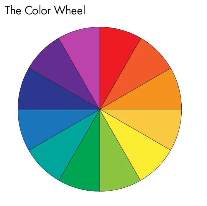
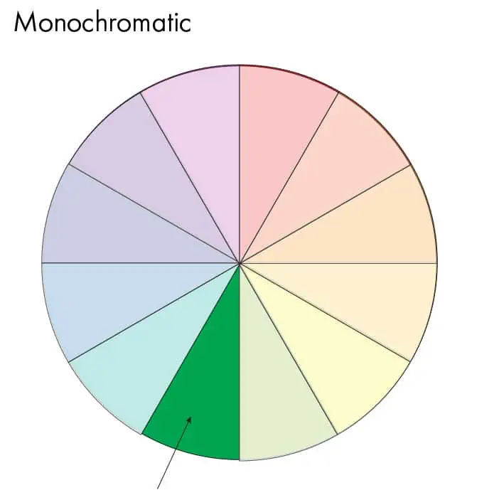
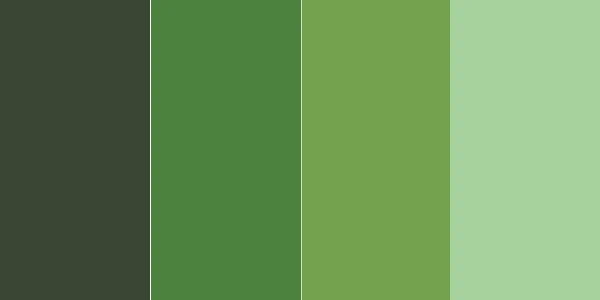
Monochromatic
Monochromatic uses colors from one hue, for instance, all greens.
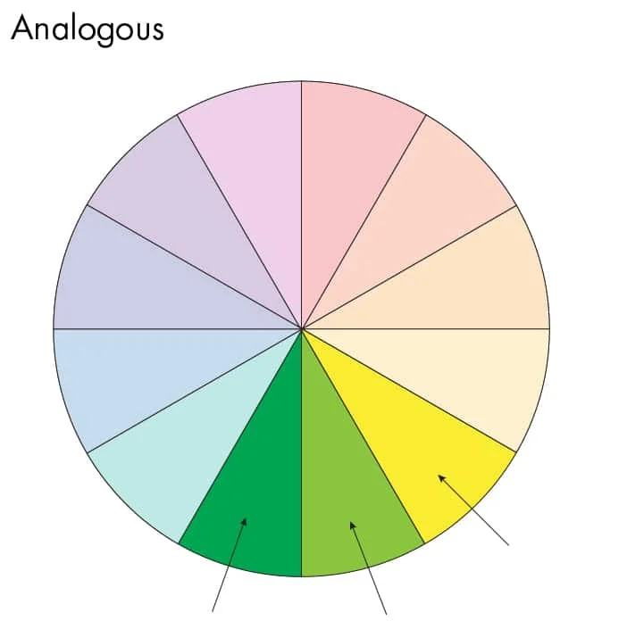
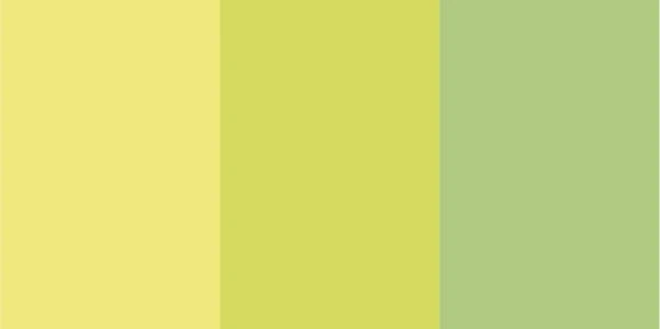
Analogous
Analogous uses colors that are next to each other on the color wheel.
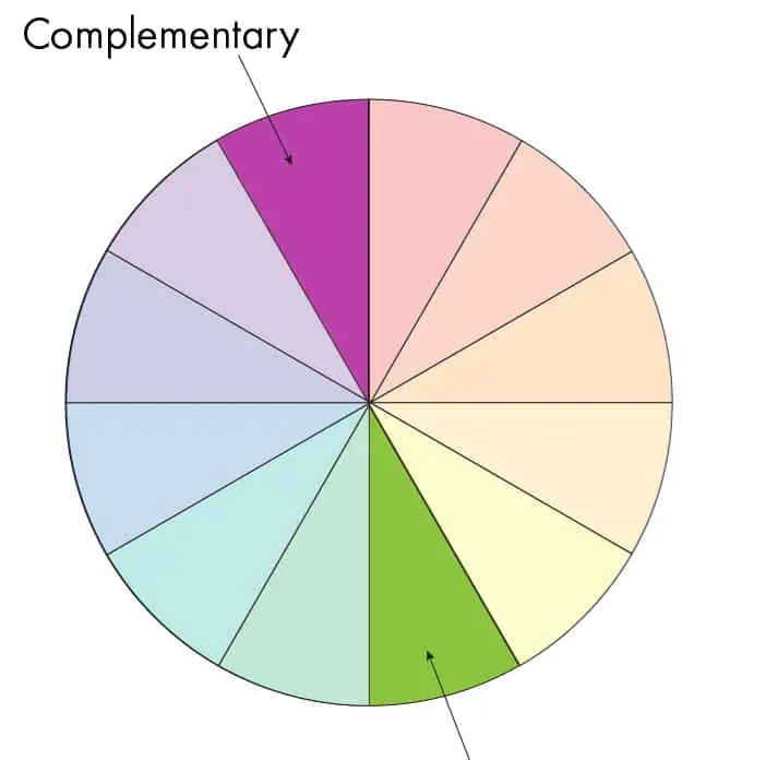
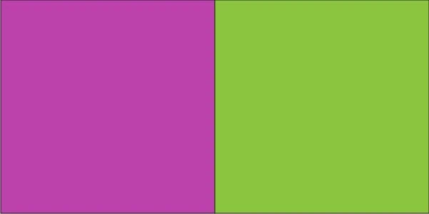
Complementary
Complementary colors are opposite each other on the color wheel.
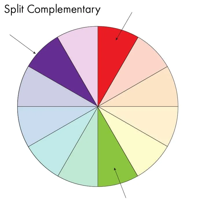
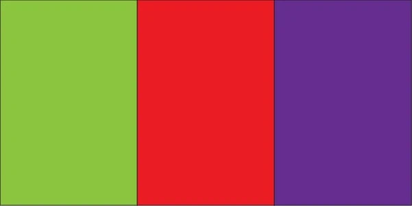
Split Complementary
Split complementary uses a color and the colors next to the complementary color.
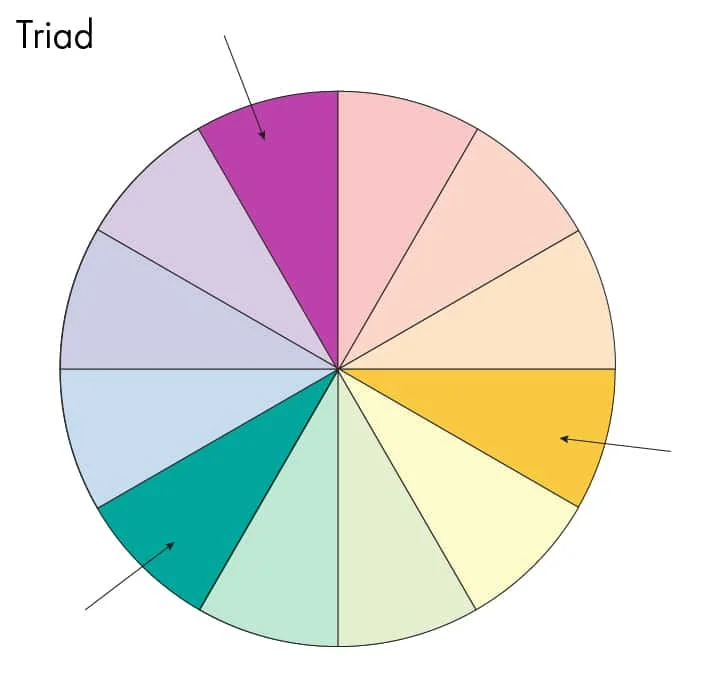
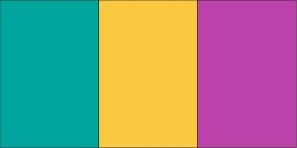
Triadic
Triadic uses 3 colors that are equally spaced around the color wheel.
Other Ways to Find Color Inspiration
Most of the time, I like to find my inspiration elsewhere. Here are my go-to inspiration sources.
Nature
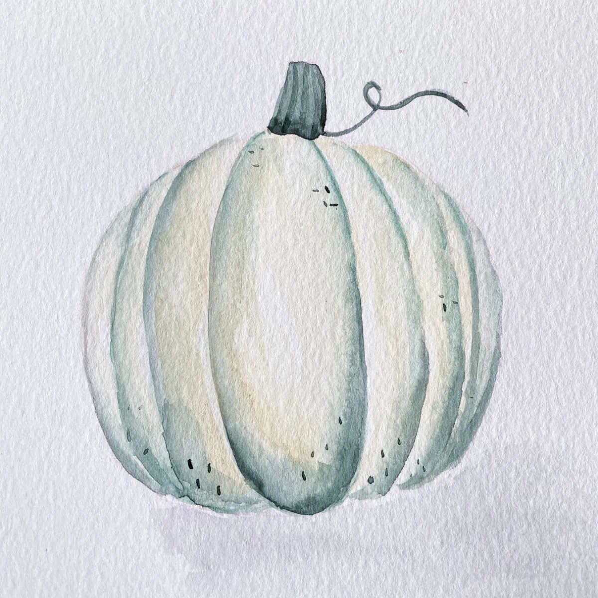
Have you ever stopped to notice the beautiful colors in nature? Next time you’re out, stop and take photos to use as inspiration.
I love how pink flowers look against a green background. A fall leaf on a stormy day is really pretty too!
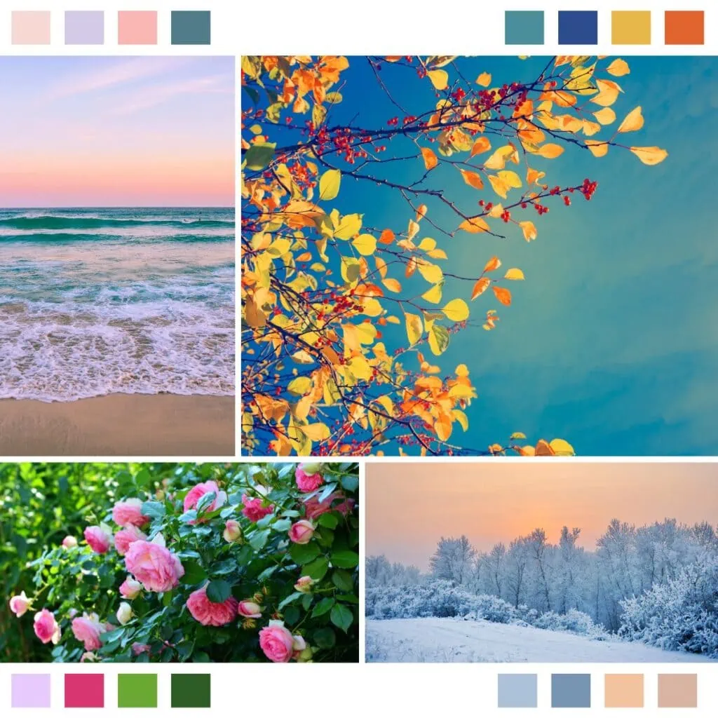
Stock photos are also a good place to find inspiration if you can’t get out.
Your Surroundings
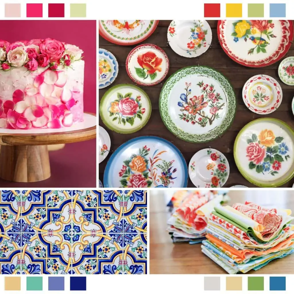
Beyond nature, think about the things you own. Your stuff can create gorgeous color palettes.
One day I was inspired by a pile of laundry on my bedding. A stack of dishes can provide a pretty color scheme.
Vintage fabric can be a nice source. What about food? Inspiration is everywhere.
Your Closet
Look in your closet and pay attention to the colors. You probably wear those colors because you like those colors.
(My closet was filled with black clothing for the longest time, so this tip only recently started working for me.)
Seasonal Color Analysis
This is my new favorite place to find color palettes. Pinterest is a great place to see a lot of them at once.
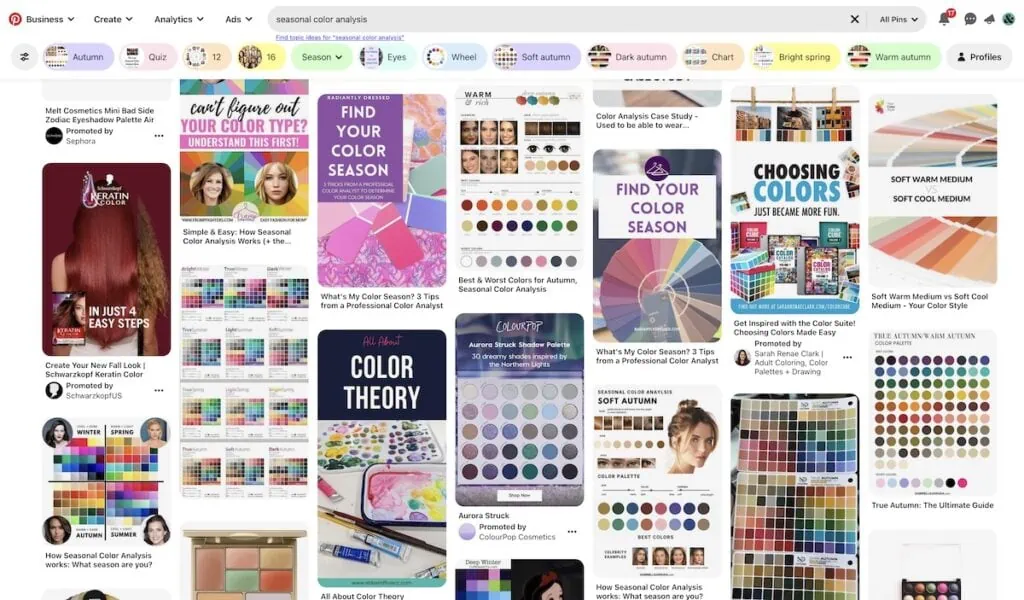
I just had my colors analyzed and I find my color palette (soft autumn) so inspirational. These colors just work so well together!
You can use them literally (autumn for an autumnal landscape) or you can use them for other reasons.
Don’t try to use every single color at once. Pick a few to work with instead.
Your Favorite Colors
I’m calling these “favorite colors”, but what I mean is what color of art supplies do you buy the most? If you look, I bet you’ll find an unintentional color palette.
I buy open-stock art supplies (versus a set) and I find that I buy a cool red, mustard yellow, sap green, aqua, teal, and navy no matter what art supply it is.
(Lately, I’m drawn to a warm red instead of a cool red, though.)
You can find my current favorite paint colors here.
Your Least Favorite Colors
On the flip side, it can be fun to stretch yourself. Look at your least-used colors and work with those. You know, the ones in your watercolor palette that still look brand-new? Use those to create art.
You may just find a new favorite. It usually works best to pair an “ugly” color with a favorite color.
That’s how I discovered that I actually love warm red.
Color Palette Websites and an App
There are a ton of color websites and apps that you can use.
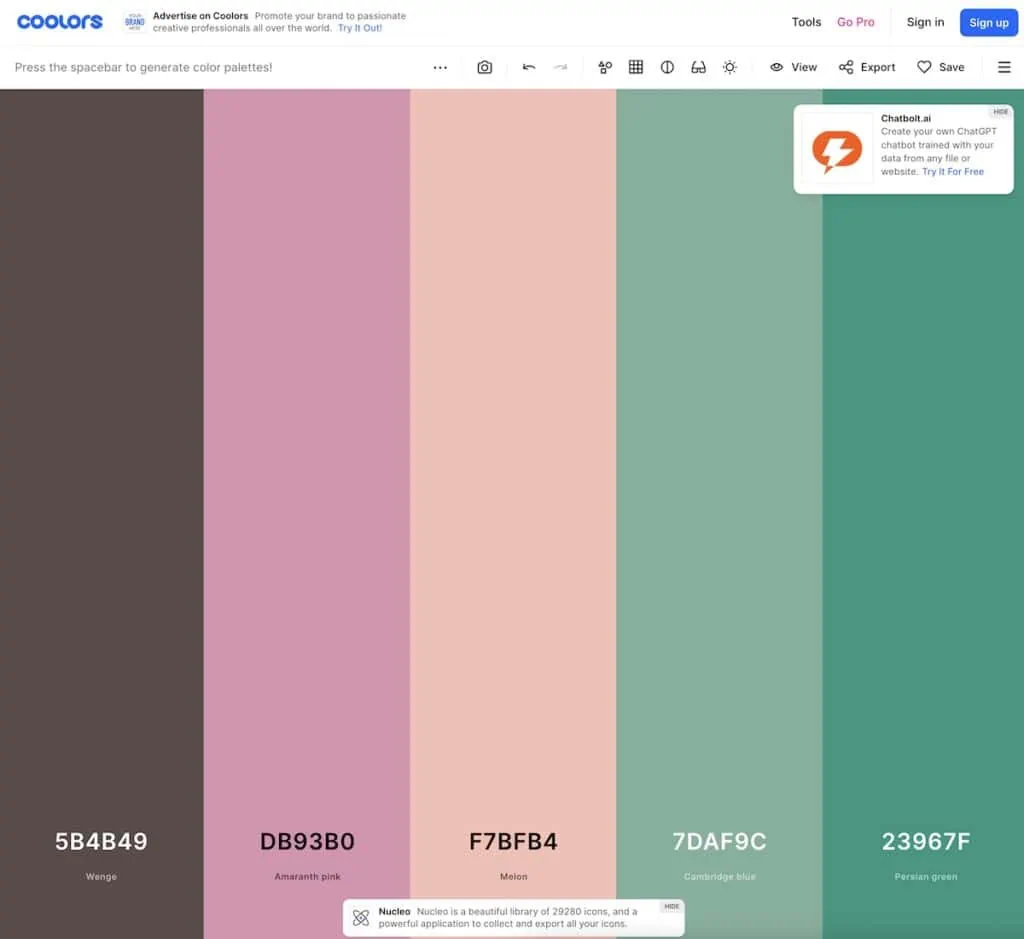
Coolers is a well-known website with tons of color palettes. You can use the hex-codes or you can color-pick them into the app or program of your choice.
If you make analog art, you can mix colors that are similar. (I find that to be a really fun challenge!)
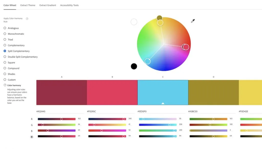
Adobe Color is also fun to play with. You can choose color scheme types or drag the colors around to create a palette. (No subscription is needed for this.)
I have some color palettes for Procreate. My retro color palette is one of my favorites to use. (I’ve added to it over time, but it’s usually my go-to palette on Procreate.)
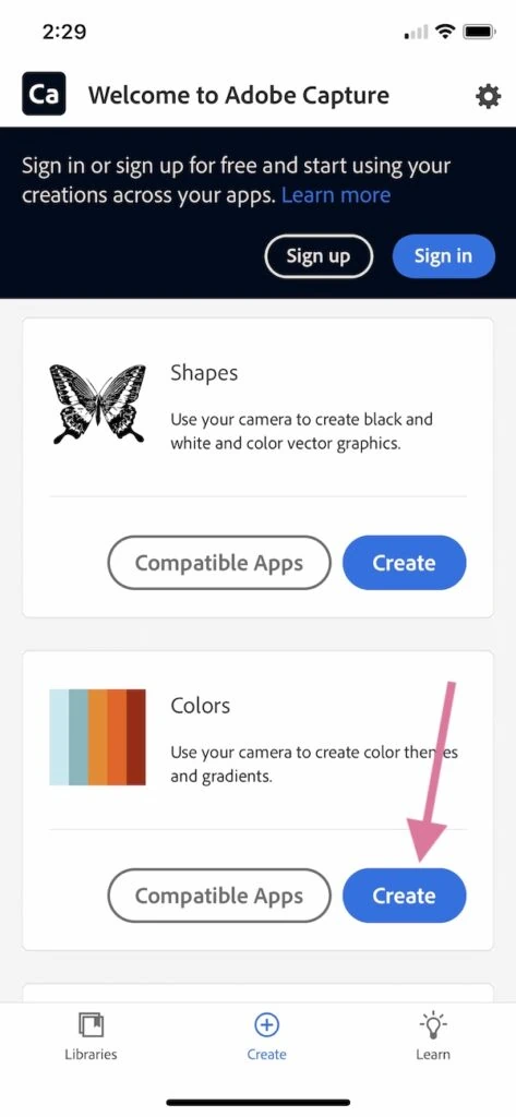
Adobe Capture
This is new to me, but it’s really fun to use. It’s an app on the phone that connects to your Adobe library. You don’t need an Adobe subscription, but you can only save 5 things. I would screenshot the color combos that you like.
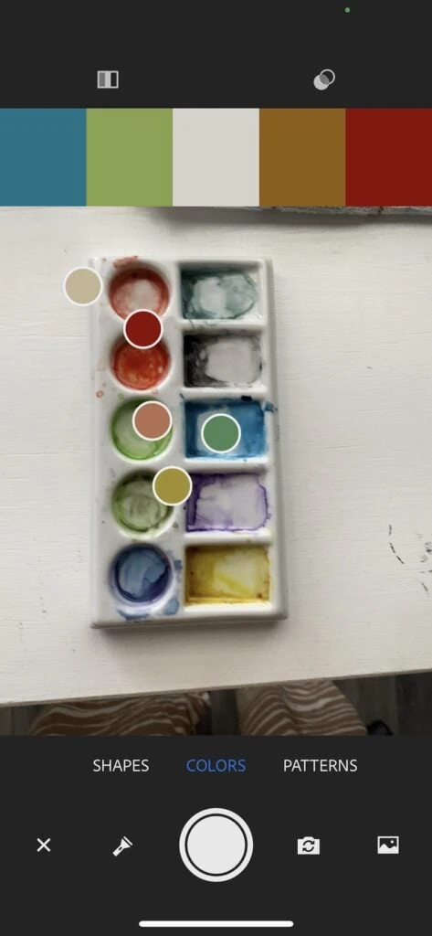
I love this app because it creates really pretty color schemes. Most color scheme generators choose weird versions of the colors that you’re seeing. But this app creates really pretty versions. I can literally take a photo of trash and it looks good.
It also creates vectorized textures, but that’s another lesson of its own.
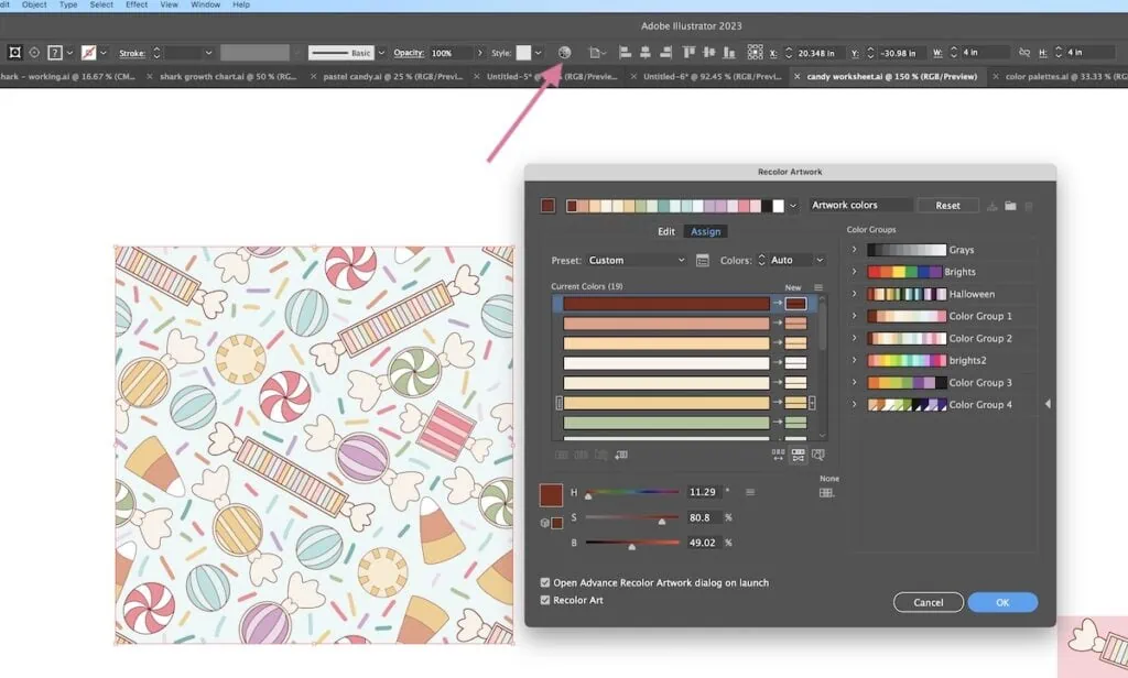
Adobe Illustrator Recolor Tool
The Recolor tool could be its own tutorial, but it’s also fun to use. You have to have a subscription to Adobe Illustrator to use this tool.
This also requires your art to be in Adobe Illustrator already.
You can change the colors of existing art to existing color palettes or tweak them using the button to randomly change saturation and brightness.
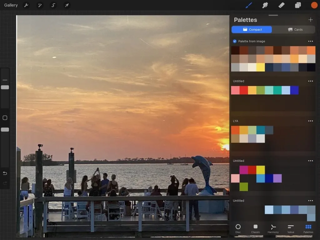
Procreate Color Palette Tool
I have more information about this in my post about creating a Procreate color palette.
Procreate allows you to create a color palette from an image. You can also use the color picker to select your colors. It’s a fast way to create color palettes from images or from the camera.
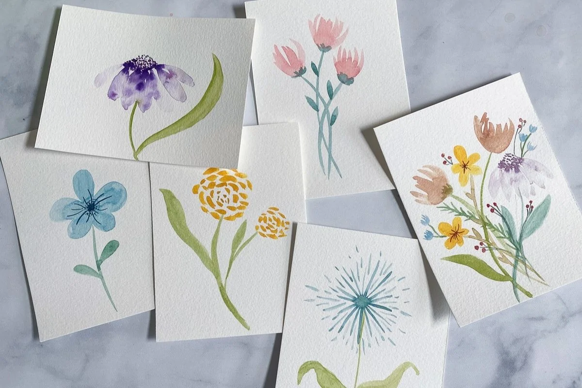
Pinterest has a ton of fun color palettes saved. When working from a color palette, try not to directly copy a color palette from an artist. Instead, find colors from non-related images.
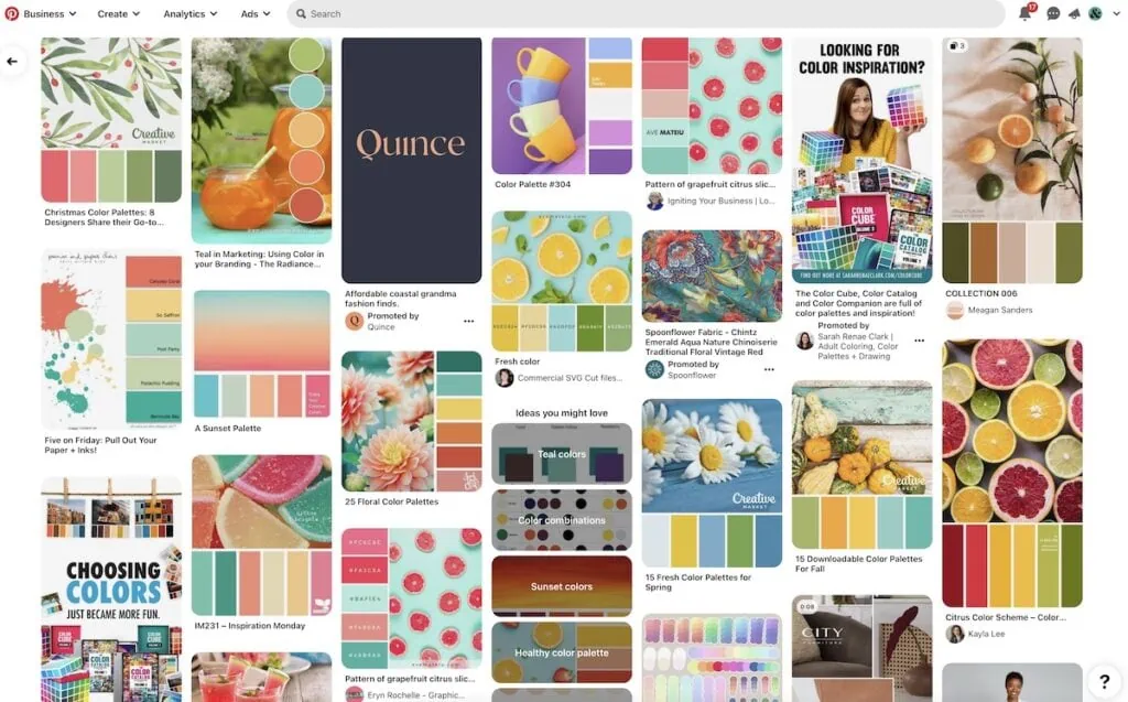
Look at landscapes, interiors, food, or fashion instead.
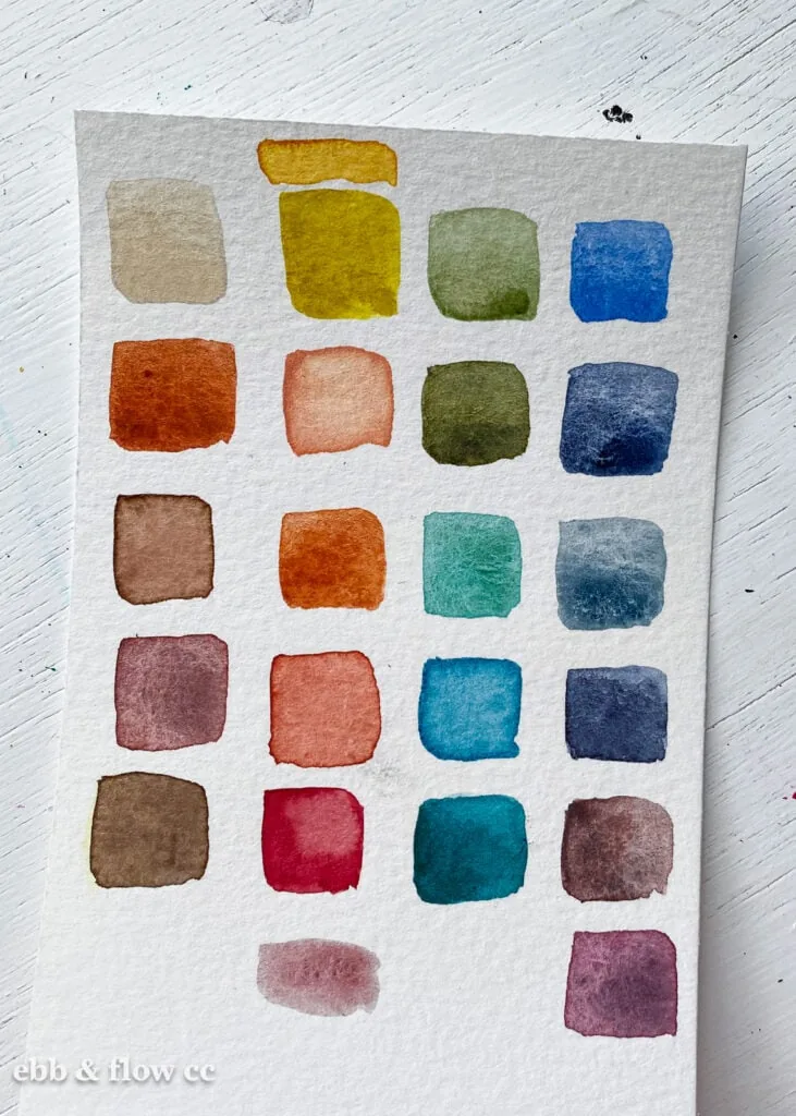
Color Cards or Paint Swatches
I learned this concept from a Skillshare class from Dylan M. She paints little cards with the paint colors she has. Then she creates color palettes from them. This is a pretty fun idea.
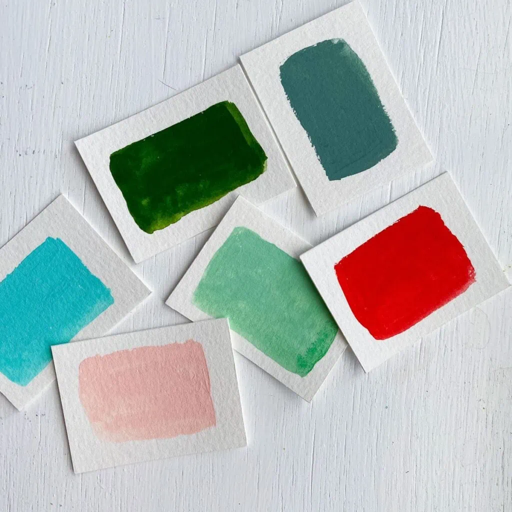
One day I dropped mine and it was fun to see the color palettes that it creates.
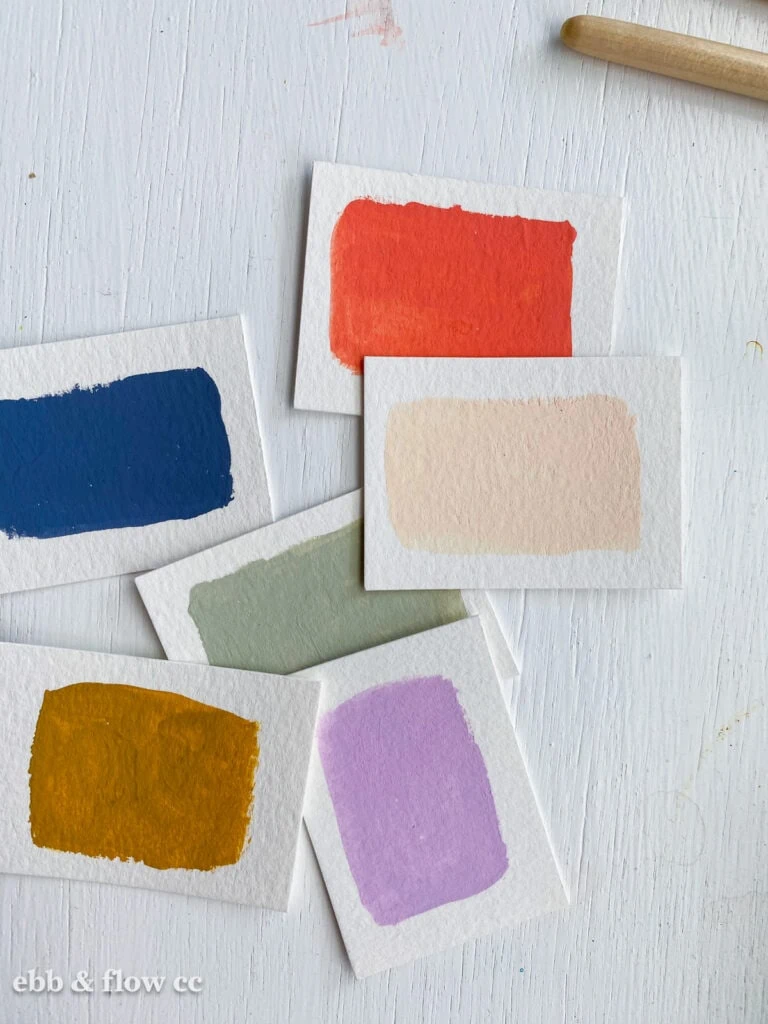
My daughter uses a similar concept, but she uses paint swatch cards from the hardware store.
Keep in Mind When Creating a Palette
Once you have some colors in mind, here are a few more things to keep in mind.
Using a Limited Palette
I love creating art using a limited color palette. I’m currently taking a class where we’re given a prompt and a very limited color palette. It’s very freeing to not have to choose my colors. It also helps me to think outside the box.
I’ve also heard of artists who use a limited color palette throughout their work and I love that idea. Some artists use about 10 colors, while others have between 20-50 main colors that they use.
This is a goal that I want to work towards.
Contrast
When choosing a color palette, keep contrast in mind. If your art feels too flat, you probably don’t have enough contrast. You need light colors, midtones, and dark colors to create enough interest.
Neutrals
Be sure to add neutrals to your color palette. You will want some form of white and black.
In most cases, pure white and black can be too harsh, so be sure to find variations of those colors to work with.
Cream and navy might work for you instead.
Saturation
Keep saturation in mind when choosing a color palette. A color palette feels cohesive when everything has roughly the same saturation.
To add interest, add one color with a different saturation level.
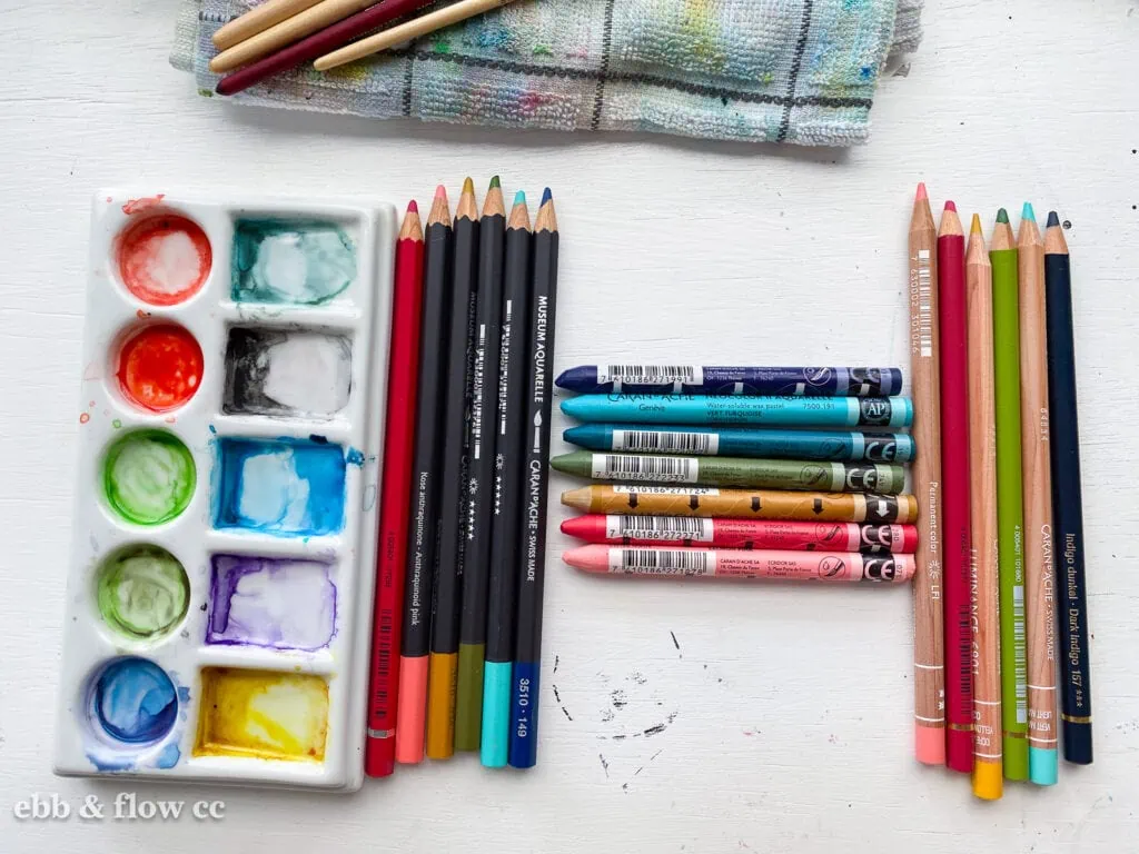
Saving Your Color Palettes
If you work digitally, you probably know how to save your color palette.
Even when I work digitally, I still enjoy creating color palettes with colored pencils or paint. I like to display them near my computer to have inspiration.
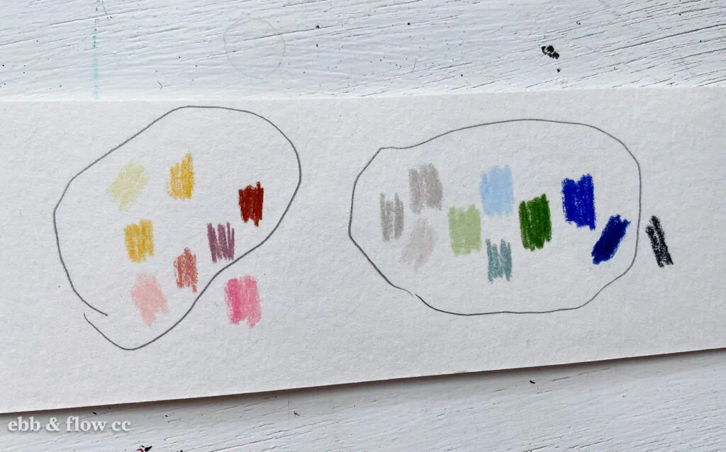
I also take photos to use with my iPad.
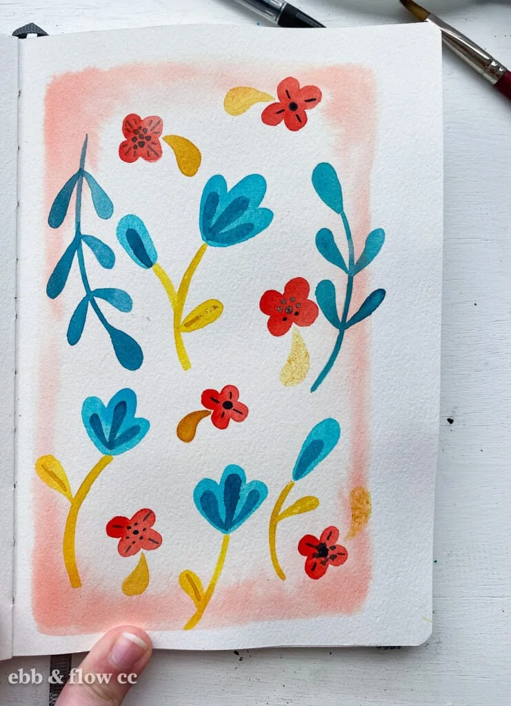
Another idea is to have a dedicated sketchbook for color schemes.
What is your favorite way to create a color palette?
You Might Also Like:
Pin for Later!