All About Color Theory: How to Mix Colors Like a Pro

I’m a self-taught artist who loves sharing tips and tutorials for painting with watercolor and gouache, and using the Procreate app on the iPad.
Color theory is one of the most important things to learn when painting. Basic color theory knowledge allows you to mix colors to get the perfect shades every time.
You might like this post on how to mix the perfect purple.
This post contains affiliate links. By purchasing an item through an affiliate link, I earn a small commission at no extra cost to you. As an Amazon Associate I earn from qualifying purchases.
These color-mixing tips work for any medium. I paint with watercolors, gouache, and acrylics, and I use all of these ideas when mixing paint.
Color Theory Basics
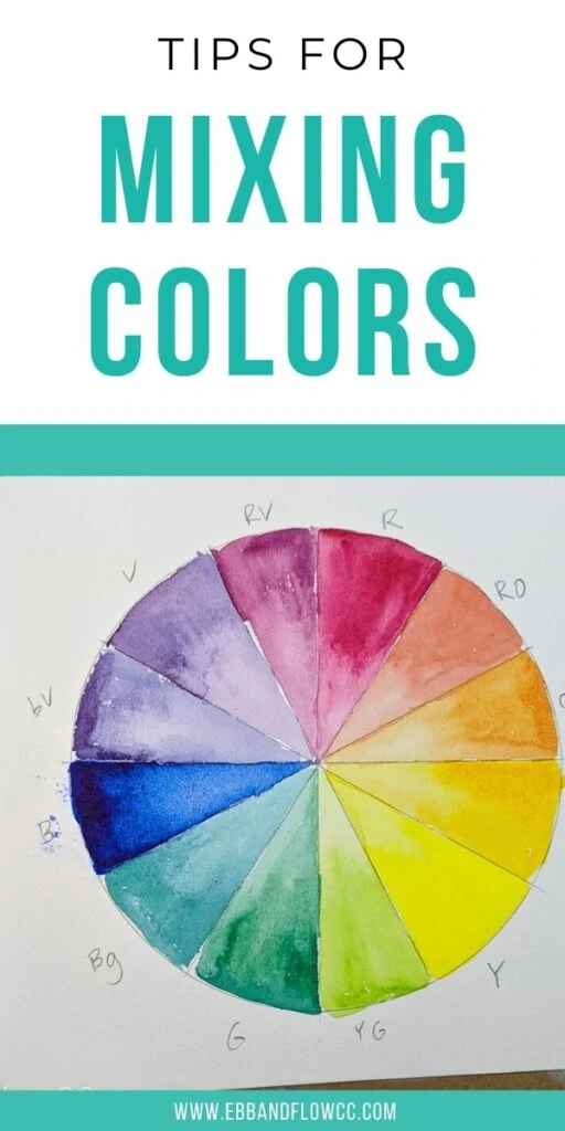
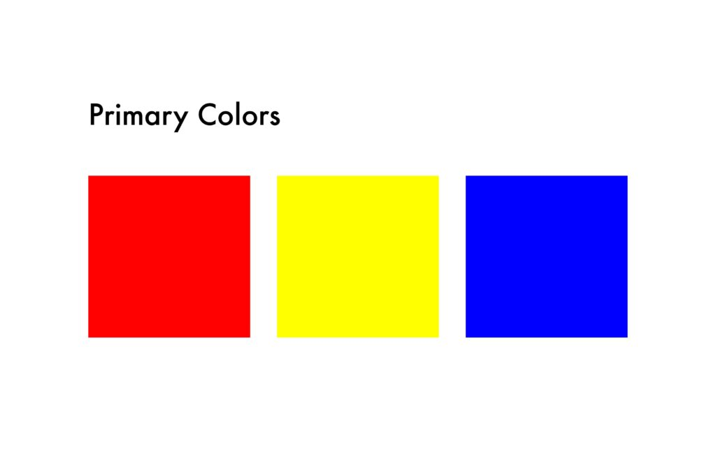
The primary colors are red, yellow, and blue. When thinking about paint, you can also consider magenta, yellow, and cyan primaries.
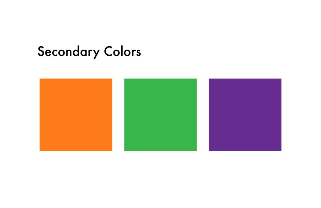
These colors can be combined to make secondary colors: orange, green, and purple.
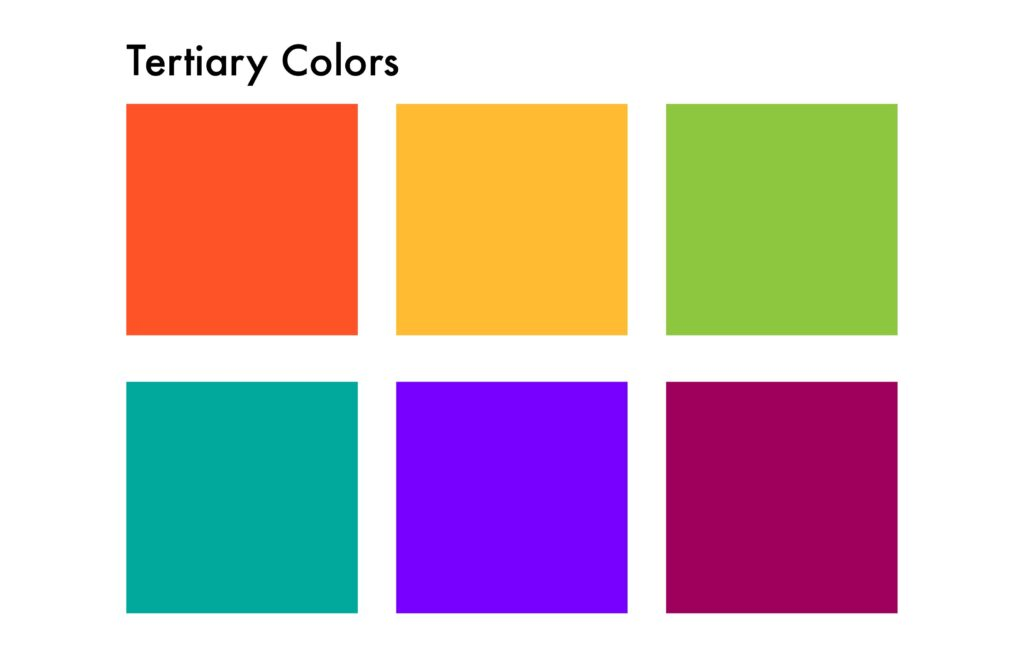
From there, the colors can be mixed to form tertiary colors: red-orange, yellow-orange, yellow-green, blue-green, blue-violet, and red-violet.
Adding black or white to these colors creates shades (darker versions) and tints (pastels.)
For watercolor, we add more water to the color to dilute the pigment when creating a lighter color.
For specific tips about mixing gouache, read this post.
How to Mix Colors
In school, we are taught that every color can be made from primary colors (red, yellow, and blue) plus white and black.
However, color mixing is a bit more complicated than that. For instance, did you know that you can actually make red paint by mixing magenta and a bit of yellow?
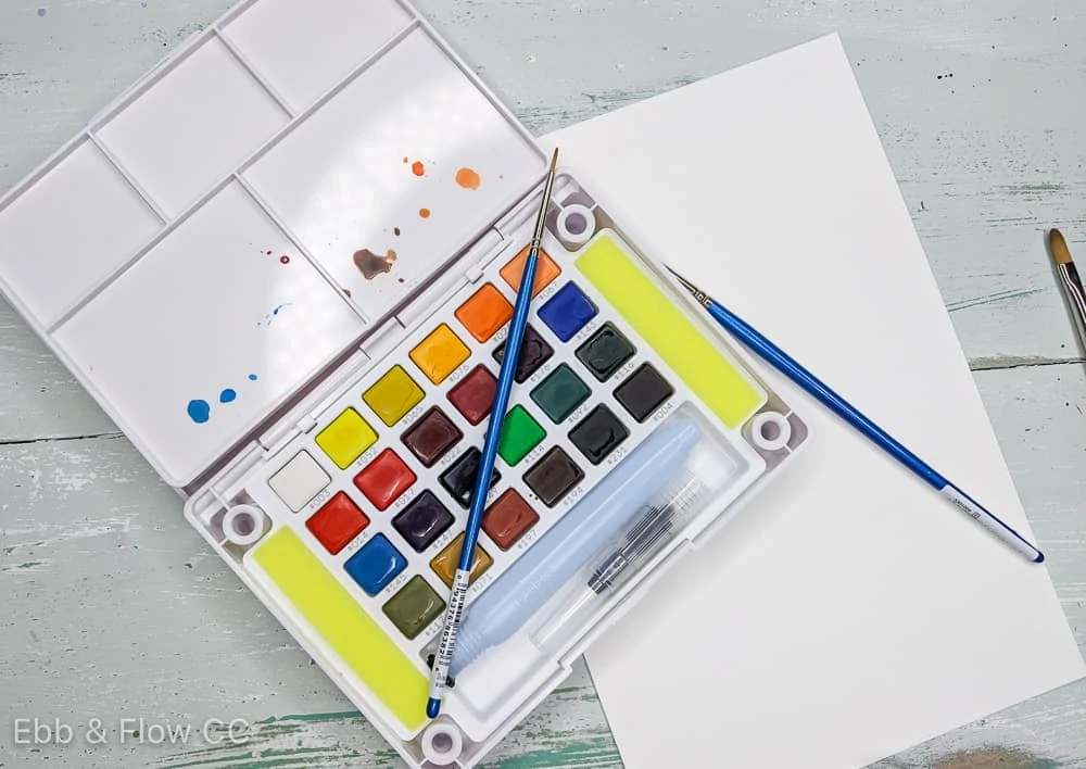
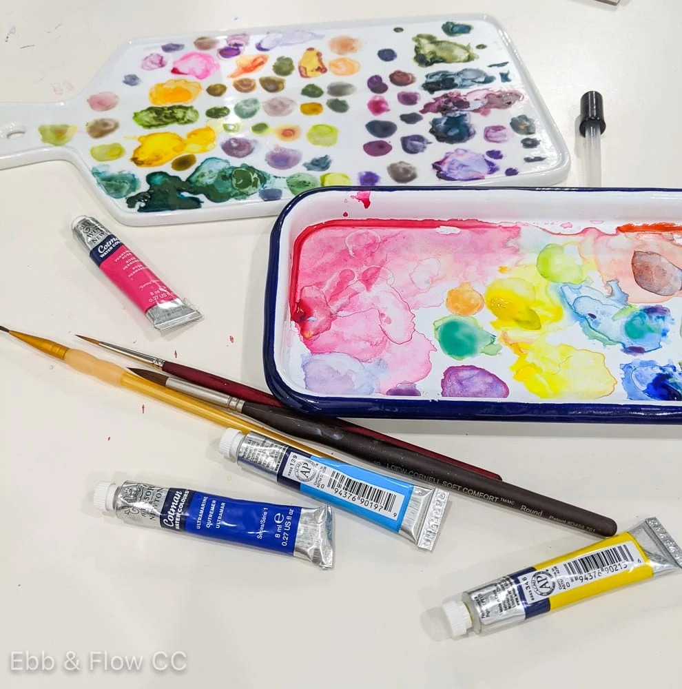
For this demonstration, I’m primarily using the Daniel Smith watercolor mixing set. I’ve included links to other colors as well.
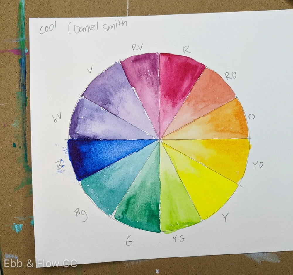
Color Temperature
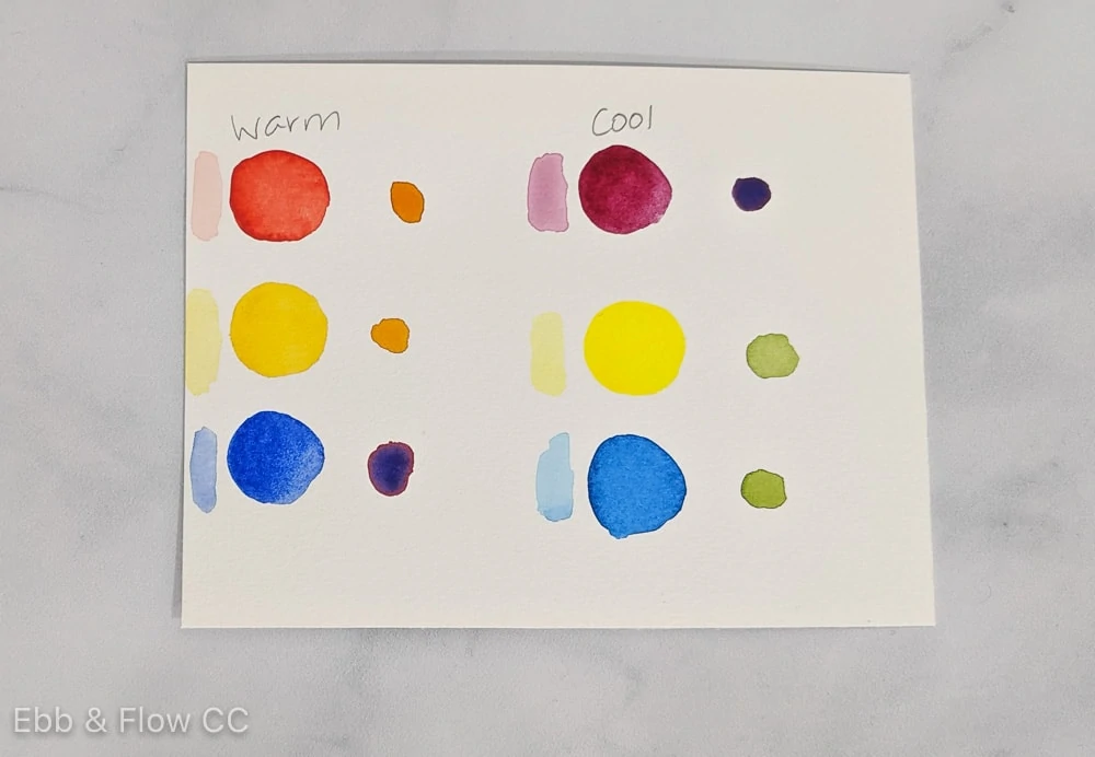
When mixing paint colors, you need to consider warm and cool colors. We all know that one half of the color wheel is warm and the other is cool, but did you know that each color can be warm or cool?
The temperature of each color affects how it mixes with other colors. For bright vibrant colors, mix cool colors (except for orange.) For bright orange, warm tones should be mixed since orange is a warm color.
Cool reds include alizarin crimson, quinacridone magenta, and permanent carmine.
Cool yellows include lemon and Hansa yellow light.
Cool blues include phthalo blue, Manganese, and cerulean.
Warm reds include cadmium red, Pyrrol scarlet, and Naphthol red.
Warm yellows include cadmium yellow, new Gamboge, and Indian yellow.
Warm blue includes ultramarine and Indanthrone blue.
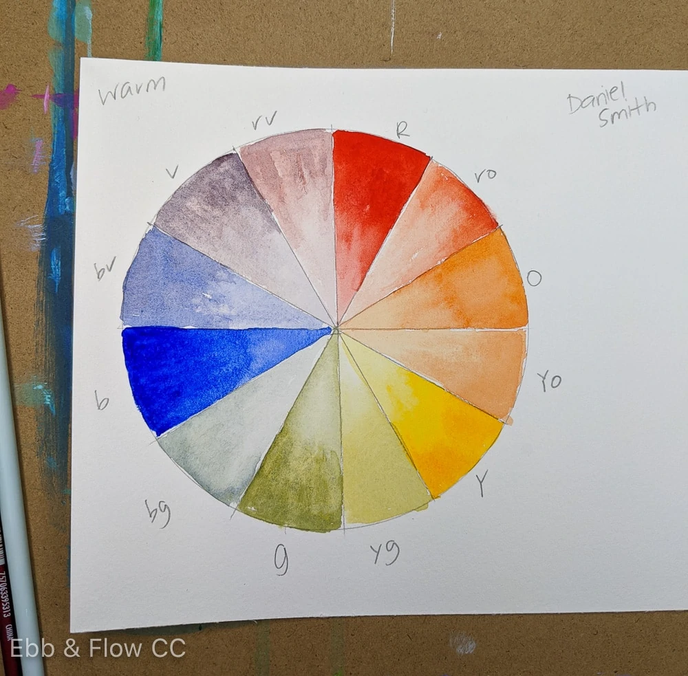
Primaries can also include a deeper range of colors, such as Perylene maroon, quinacridone gold, and Prussian blue. These colors produce a neutral color spectrum, perfect for landscapes.
It’s harder to determine the temperature of shades of blue. Ultramarine blue has more red in it, so it’s considered warm. Phthalo blues lean more green, so it’s considered cool.
If you’re having trouble telling which temperature each color is, add a bit of white to it (or dilute it with water for watercolors). You can normally tell with the pastel version.
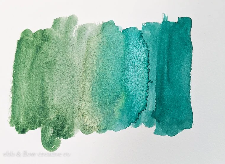
Complementary Mixing
Most people overlook this concept when mixing colors, but it’s one of my favorite ways to create unique colors.
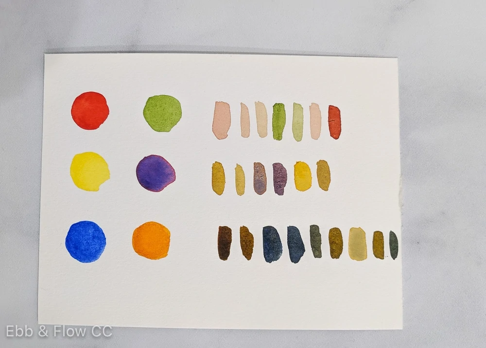
When you mix complementary colors, you can make browns and grays or tone down the color. This process creates more realistic colors.
Add a tiny bit of red for a more realistic tone of green.
This is also a good way to create neutrals. Combining ultramarine blue with burnt umber creates a cool gray.
Remember to use dark colors in complementary tones when creating grays or blacks. Get more tips for creating black watercolors here.
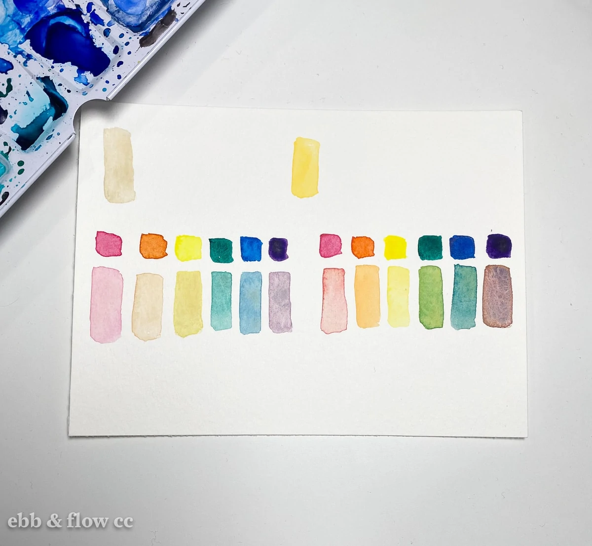
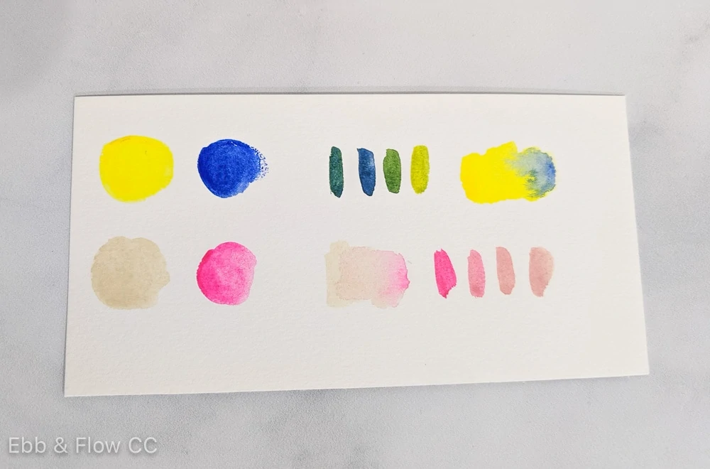
This is also a fun way to create exciting colors. I love mixing Naples yellow with ultramarine violet in watercolors to create a lovely skin tone. The second swatch shows Naples yellow mixed with opera pink, another beautiful combination.
I also love mixing greens with purples to create moody tones.
So remember to think outside the box for mixing colors. You may be pleasantly surprised!
Color Strength
When mixing colors, consider color strength. Some colors have so much pigment that it’s easy for one color to dominate the mixture.
Reds and staining blues like phthalo blue and ultramarine are typically very strong. Dark colors are also stronger.
Light colors like yellow and white are weaker; you will need more of them in a mixture.
If in doubt, use more of the light color and the tiniest drop of the darker color when mixing. Add a small bit at a time to get the right color.
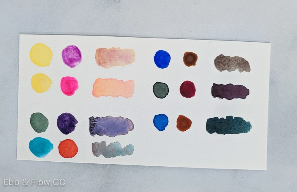
Mixing with Single Pigment Colors
If you’re still getting muddy colors, it may be time to check the label on your paint. Artist-quality paints will tell you the pigments used to create them.
The pigment will be labeled using 2-3 letter code and number, typically starting with P. For instance, PB-28 is cobalt blue.
For more pigment information, visit the manufacturer’s website. Retail stores like Blick also provide this information.
Ideally, you want to use as few pigments as possible for mixing. However, sometimes, those additional pigments can produce unexpected results.
This is one reason to buy the more expensive, artist-quality paints. They typically contain fewer pigments, and you know exactly what you’re getting.
Cheaper paints do not label the pigments, but you typically get more than one pigment in each color.
Ways to Mix Color
You have a few options for actually mixing the colors.
On a Palette
You can use a palette to mix colors. For acrylics and gouache, I prefer palette paper. Watercolor is easier to clean, so I use my custom palette palette.
Whatever palette you use should have a white background to ensure your color is correct.
Read more about palettes here.
Depending on how much paint you need to mix, you can mix with a brush or a palette knife. If you use a brush, avoid getting the paint in the brush’s ferrule (the metal part).
As discussed earlier, add intense colors in smaller quantities for the best results.
On the Surface as You Paint
The other way to mix color is on the surface as you paint. This creates a blended look.
By the way, if you’re having trouble getting the color you want and you use this method, you may be combining colors as you work. I notice this a lot with white.
Sometime, it’s a better idea to let the paint dry and then add a new layer.
You might be interested in learning more about how to make a color wheel stencil.
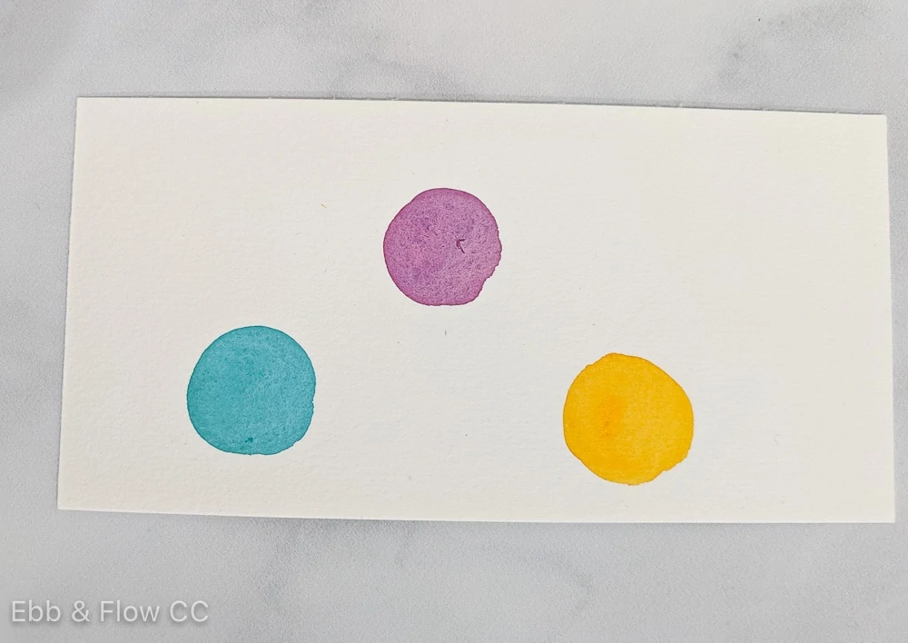
Basic Color Schemes
This is an overview of color schemes. It’s a good place to start, but you’re always welcome to combine whatever colors you want.
With all color schemes, it’s also a good idea to add some neutrals. They help ground the painting and help the colors pop.
Monochromatic
This color scheme uses colors from one hue, such as light blue, medium blue, and navy.
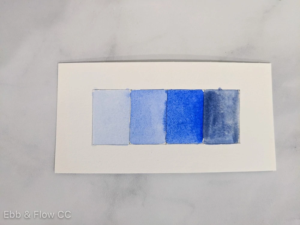
This creates a harmonious, calm effect.
Analogous
This color scheme uses colors that are next to each other on the color wheel, such as yellow, green, and blue-green.
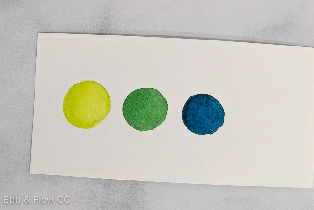
Analogous color schemes also create a harmonious, calm effect because it can often be seen in nature.
Complementary
This color scheme uses colors across from each other on the color wheel. For example, red and green.
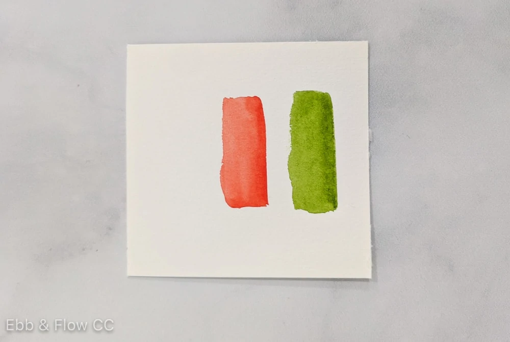
Complementary color schemes create tension and excitement. For best results, use one color as the primary color and the 2nd color as the accent. Don’t use them in 50/50 proportions because they will fight too much.
Split Complementary
This color scheme uses colors other than complementary colors, such as red, blue-green, and yellow-green.
Split complementary color schemes also create excitement.
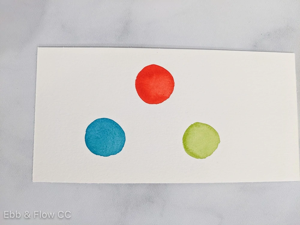
Triadic
This color scheme uses three colors that are equally spaced around the color wheel. For example, blue-green, red-violet, and yellow-orange.
You Might Also Like:
- How to Create Color Palettes
- How to Mix Pastel Colors with Watercolors
- The Best Gouache for Beginners
- How to Mix Green Paint
- Tips for Painting with Gouache
- How to Mix Red with Watercolors
- Basics of Watercolor Painting
Pin for Later!