How to Create a Color Palette in Procreate

I’m a self-taught artist who loves sharing tips and tutorials for painting with watercolor and gouache, and using the Procreate app on the iPad.
Learn how to create a color palette in Procreate. There are so many ways to make your own palettes in Procreate. Get easy tips for creating cohesive color schemes.
This is part of my series on how to use Procreate.

This post contains affiliate links. By purchasing an item through an affiliate link, I earn a small commission at no extra cost to you. As an Amazon Associate I earn from qualifying purchases.
Creating color palettes to use in my artwork is one of my favorite things to do.
They can be used over and over again, saving you loads of time when creating your artwork.
Learn how to sell color palettes for Procreate on Etsy.
How to Create a Color Palette in Procreate
The color palette can be accessed by touching the circle in the top right corner of the screen.
The Color Menu
Procreate offers many ways to create color palettes. Your preferred method will depend on what you’re comfortable using.
Learn more about color theory here. This post is about mixing paint colors, but you can learn a lot about color palettes as well.
History
Your color history shows the last 10 colors that you’ve used. It appears in every menu except for the palettes menu.
Your history is not relative to the canvas that you select, but your last 10 colors overall.
If you need to access previously used colors that are gone from the history, you can use the color picker tool.
Your history can be cleared by clicking “clear.”
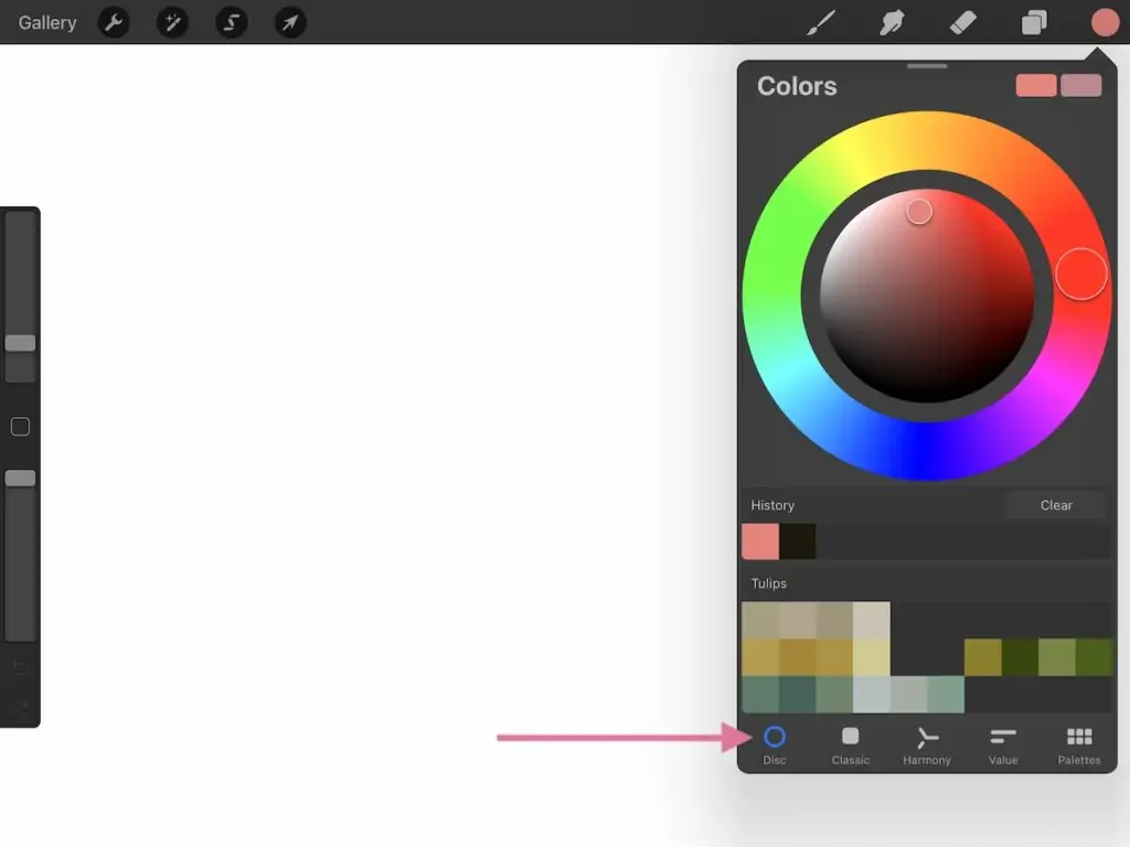
Disc
The disc option for choosing colors is pretty simple. Pick the hue on the outer disc by clicking on the color you want.
The center circle changes the saturation and value of the color. It’s easy to get a bright color, a pastel, or a muted color by moving the circles of color.
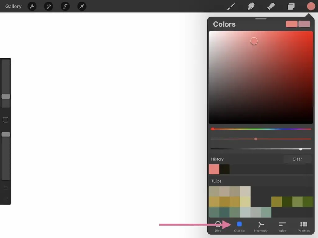
Classic
The classic option looks a bit more like Photoshop. Change the colors, saturation, and value with the sliders.
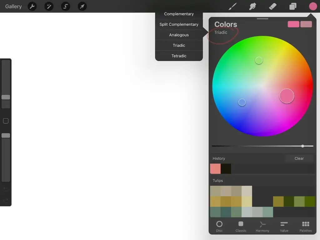
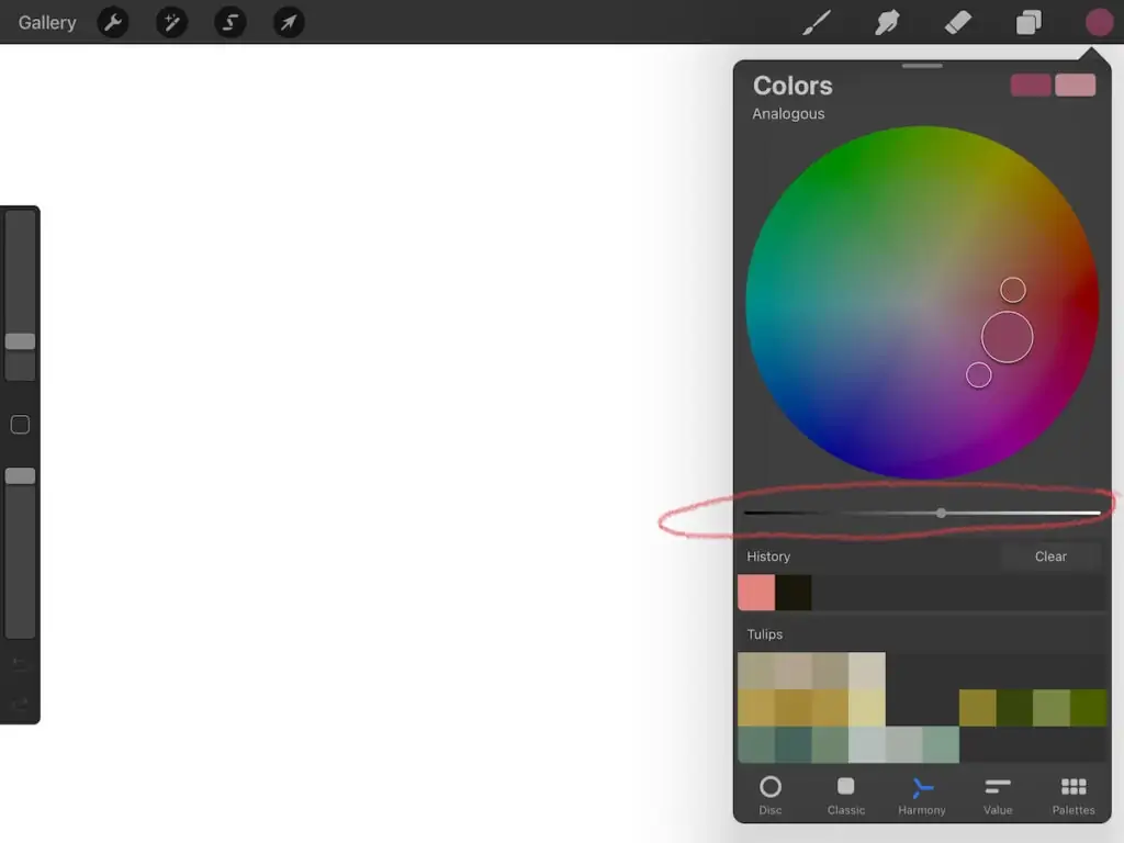
Harmony
The harmony option makes it easy to create harmonious color palettes with your chosen color.
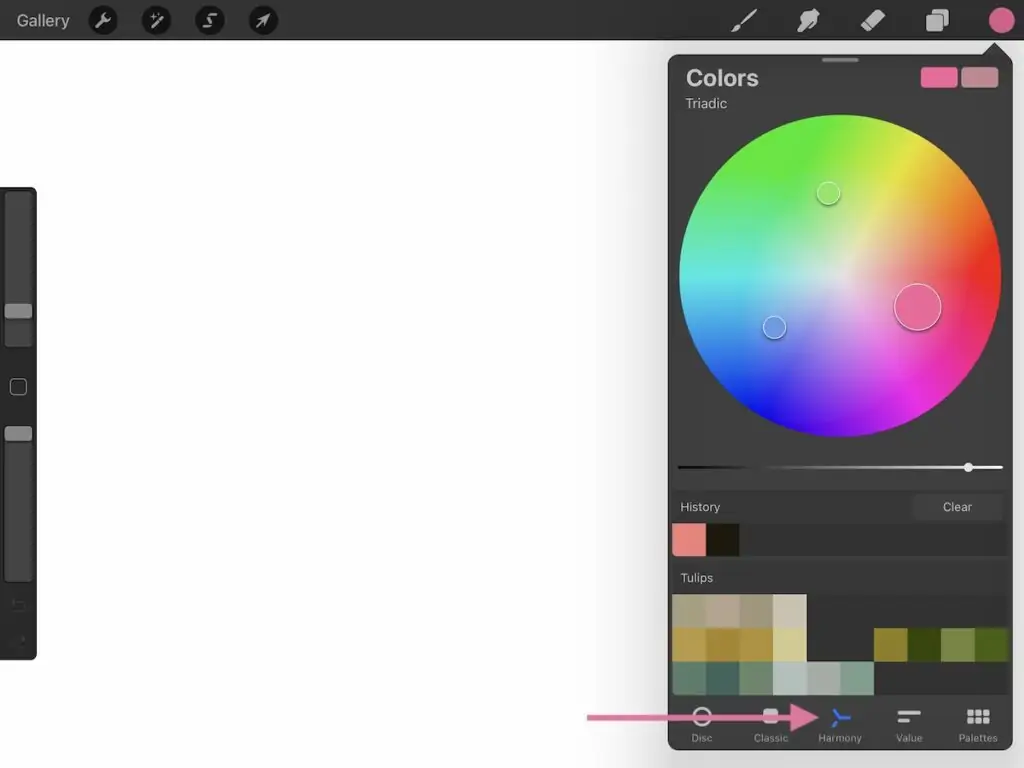
There’s a menu at the top left of the screen to change the harmony options.
Value Slider
You can change your chosen color by clicking on the circle. Use the slider to change the value of the color.
Complementary
This chooses the complementary color for your chosen color. (Complementary means the color across the color wheel.)

Split Complementary
This option chooses the split complementary for your chosen color.
(Split complementary refers to the colors on each side of the complementary color. For example, the complementary color for yellow is blue. The split complementary colors for yellow are blue-green and blue-violet.)

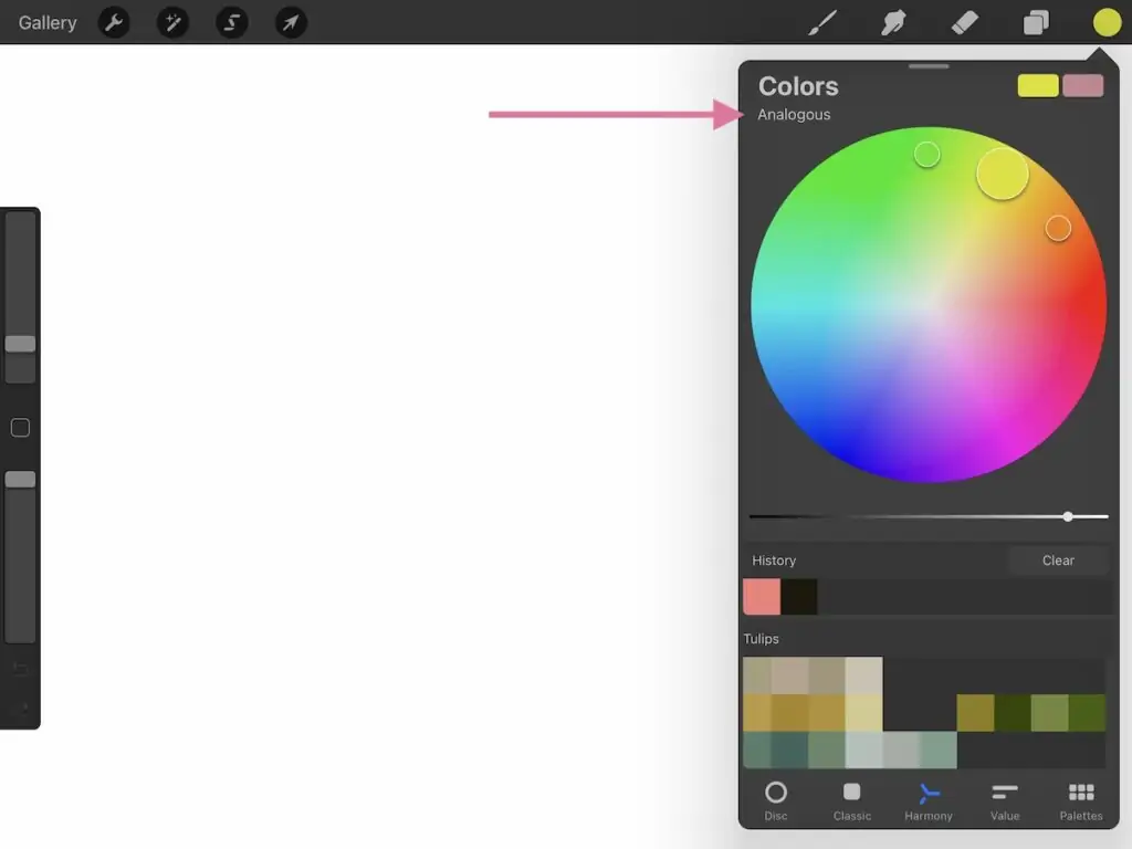
Analogous
This option chooses the analogous colors for your chosen color.
(Analogous refers to the colors next to your chosen color. Yellow’s analogous colors are orange and green.)
Triadic
This option chooses the triadic colors for your chosen color.
(Triadic refers to 3 colors equidistance apart on the color wheel. Yellow’s triadic color scheme includes cyan and magenta.)

Tetradic
This option chooses the tetradic colors for your chosen color.
(Tetradic refers to 4 colors that are equidistant on the color wheel. Yellow’s colors include green, blue, and magenta.)

Value
The value menu allows you to change colors with 3 different options: HSB, RGB, and hexadecimal.
You’re probably familiar with these options if you’ve used photoshop. Hexadecimal is used in web design.
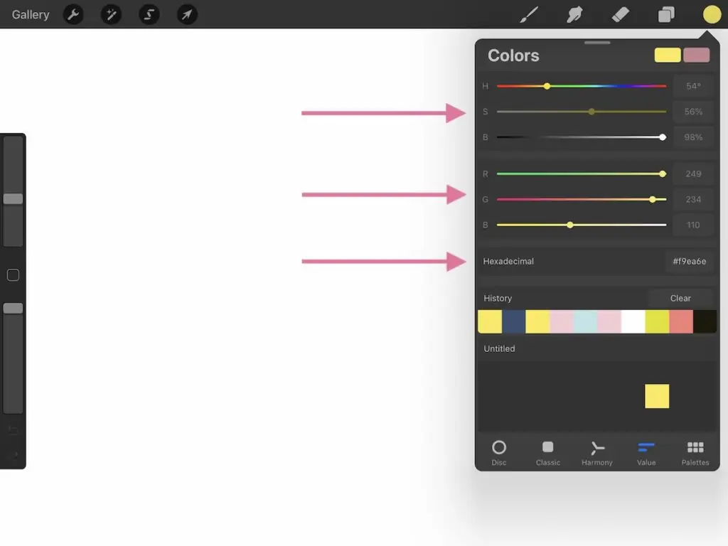
HSB
These sliders change the hue, saturation, and brightness.
RGB
These sliders change the red, green, and blue of each color.
Hexadecimal
Hexadecimal uses a 6 digit combination of letters and numbers.
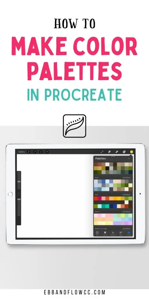
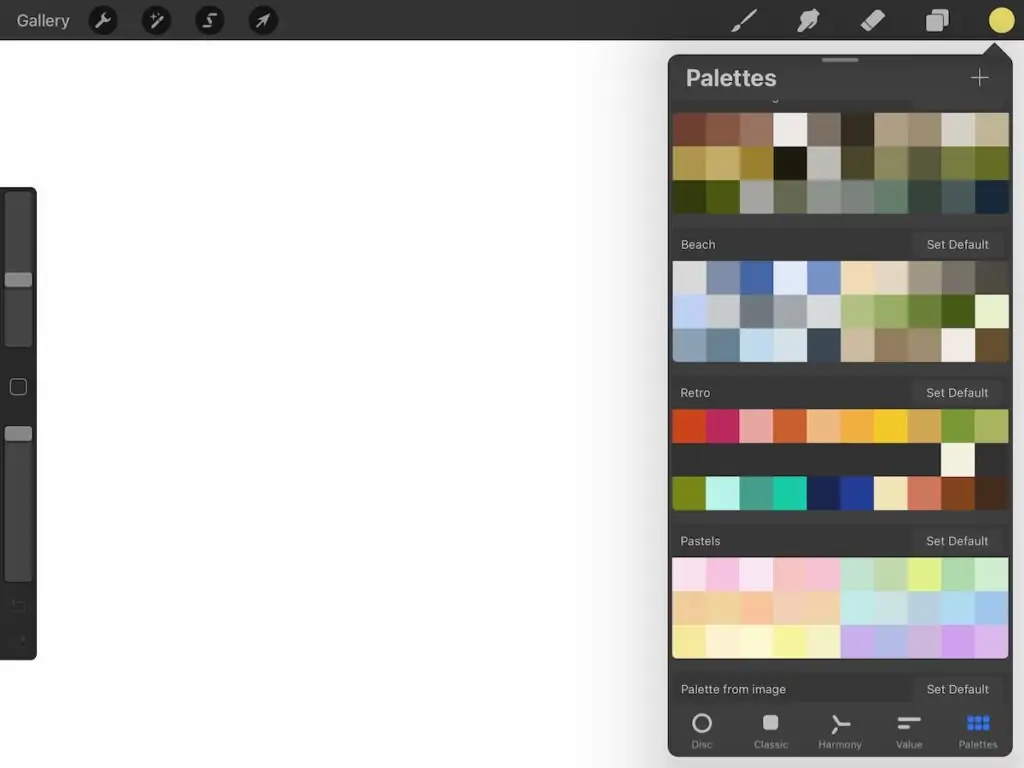
Palettes
The palettes menu holds all of your color palettes. Procreate comes with a few sample color palettes, but it’s easy to make your own.

Default
Any palette can be set to default so that it’s easily accessed when working in Procreate.
Creating a New Color Palette
Procreate offers several options for creating a color palette. Each palette has spaces for 30 colors.

Create New Palette
This option creates a blank palette in your palette list. You can rename it by clicking “Untitled.”
From there, you can select colors using any of the color choosing menus.
Click a space in the blank menu to add it to the palette. The color can be moved by clicking on it and dragging it to a new space.
Colors can be deleted by holding the color and selecting “delete swatch.”
New from Camera
Make sure that you have given your Procreate permission to access your camera.
Click “new from the camera and move your iPad around until you like the colors. When you’re happy, click the photo button (the circle) to add the colors to your palette.
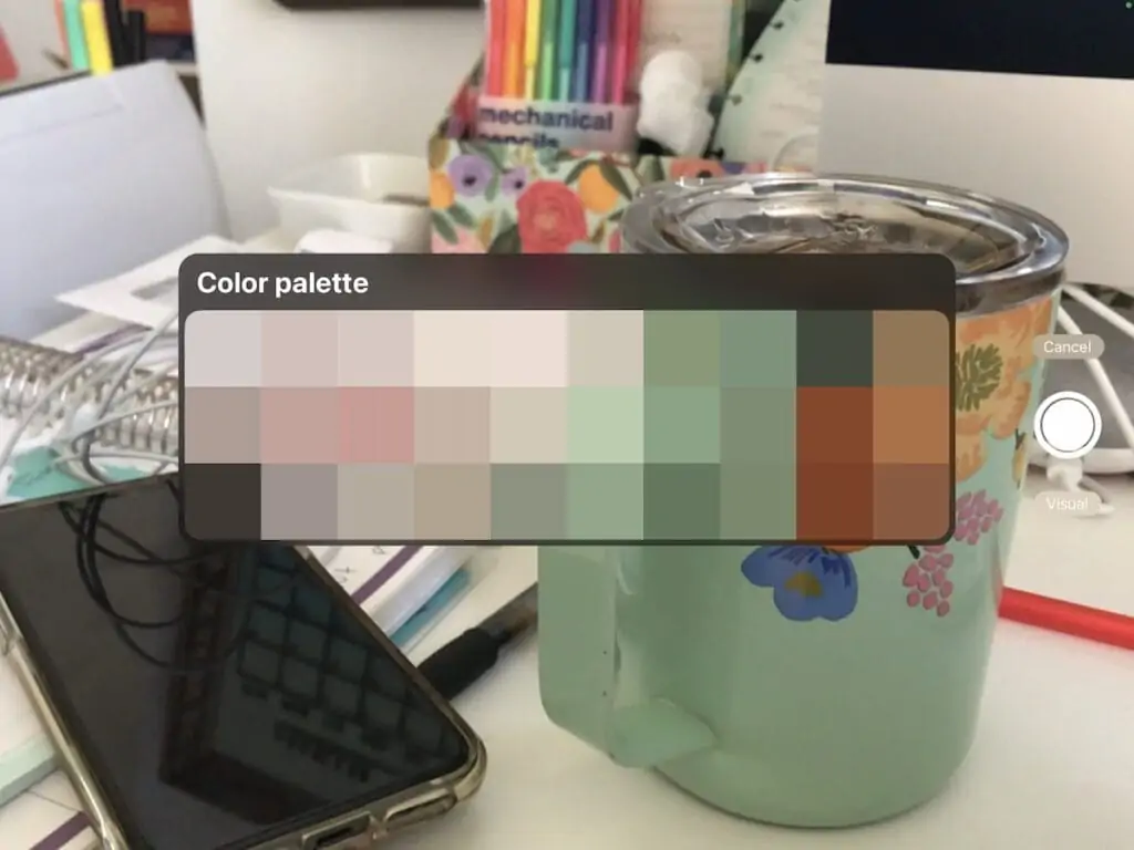
The colors are automatically added to a palette.
New from File
You can also make a color palette from a file. This option works best for JPEG and PNG files.
New from Photos
Use your photos on your iPad to create a color palette.
Selecting this option will automatically create a color palette from the photo you choose.
For a full tutorial for creating color palettes from an image, click here.
Basics for Creating a Color Palette From Scratch
You can also create color palettes from your imagination.
The sky is the limit and you’re free to use whatever colors you want, but here are a few things that I keep in mind while creating my color palettes.
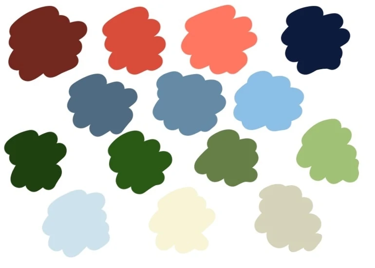
Number of Hues
I prefer working with a limited color palette in Procreate, so I typically limit the number of hues to between 3 and 6.
This sounds boring, but I typically include a hue in both temperatures to keep things interesting. For instance, my beach palette has both warm and cool blues.
Contrast and Value
The other important thing that I do is make sure that the colors have enough contrast.
I add in lighter and darker versions of every color so that I have shadows and highlights in my palette.
Saturation
Saturation refers to how intense a color is.
When you make your palette, keep the saturation the same in all of the colors to make a more cohesive palette.
For example, use all muted colors or all pastels. The colors will work together better.
Add Neutrals
I also love adding neutrals to my color palette. This prevents me from having to scroll through my other palettes for the perfect off-black.
A pale color works great for backgrounds and dark colors work great for details.
This doesn’t always mean blacks, whites, grays, and browns. I typically use muted pastels for backgrounds and dark colors for detail work.
Navy blue line work can be more intriguing than black in the right color palette.
Get more tips for choosing a color palette here.
Testing Your Color Palette
When my color palette is finished, I test the color palette to make sure that the colors are different enough from each other and have enough contrast.
This is simple to do. Open a new layer and start scribbling. Put similar colors next to each other to make sure that they are different.

There are always a few colors that are almost identical and need to be changed.
This is also a good chance to make sure that your palette is cohesive.
You Might Also Like:
Pin for Later!