
Watercolor Starter Colors: The Colors to Buy When Starting Out
I’m a self-taught artist who loves sharing tips and tutorials for painting with watercolor and gouache, and using the Procreate app on the iPad.
Learn more about which watercolor starter colors to buy when you start watercolor painting. These must-have watercolor colors will allow you to paint a variety of subjects.
Get more easy watercolor tutorials here!
This post contains affiliate links. By purchasing an item through an affiliate link, I earn a small commission at no extra cost to you. As an Amazon Associate I earn from qualifying purchases.
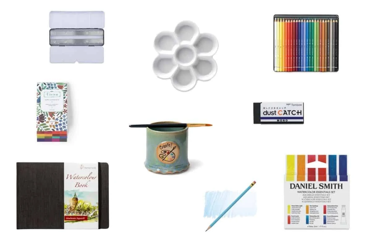
You might also like this guide to watercolor supplies.
Watercolor Colors FAQs
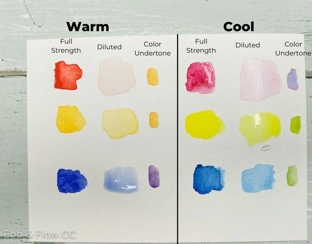
How do I tell if a watercolor paint color is warm or cool?
All colors lean towards being warm or cool. For red colors, you want to determine if the red is more purple or orange. For yellows, you want to determine if the color is more green or orange. For blues, you want to see if the color is more purple or green.
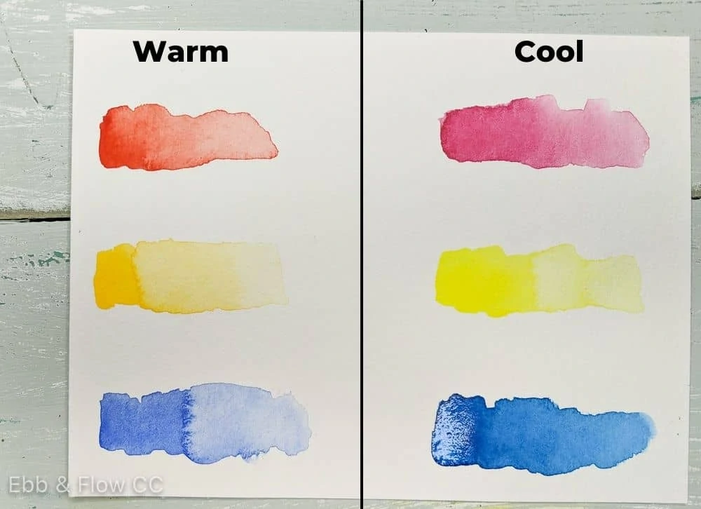
The easiest way to see this is to dilute the color a bit with water. The undertones show up much better with pastel versions of the color.
I wrote an entire guide to color mixing if you’re looking for more help.
What is the difference between artist and student grade watercolor paint?
Student grade paint is typically made with fewer pigments or lower quality pigments. They are often made with multiple pigments, which can make color mixing difficult because you’re mixing several colors together.
Student grade paints often lack colorfastness information, which tells you how long the color will last in sunlight. Lightfastness is typically indicated by the ASTM rating between I and V (I being the best and V being the worst.)
The really cheap student grade paint can result in a chalky piece of art, which can be frustrating.
Artist-grade watercolor paint is made with higher quality pigments. They are typically made of 1 pigment and are labeled clearly with this information. The lightfastness information is also labeled.
Pigments are labeled with a letter and number combo, like PV19 for quinacridone rose. If multiple numbers are listed, that means that multiple pigments have been used, and mixing the colors may result in muddy colors.
In my experience, artist-quality paints are mixed with the binder better and are just nicer to paint with.
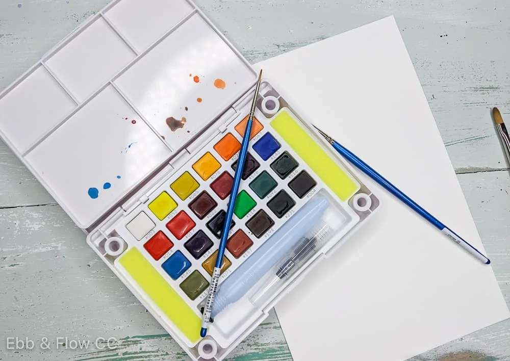
Should I buy watercolor tubes or pans?
I typically buy tubes because they’re easier to find. They’re also more economical than pans. (For convenience sake, I dry my tube paints in pans in a palette.)
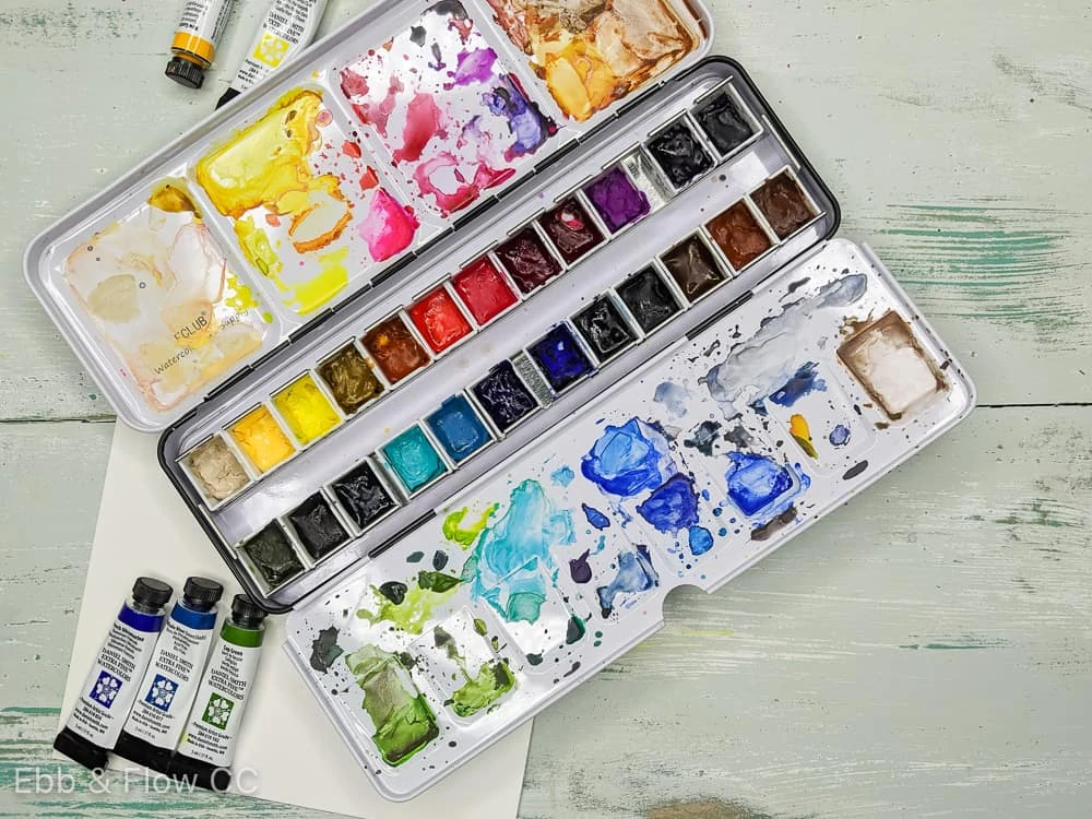
Pans can be bought open-stock or you can buy a ready-made palette. However, they can come with colors that are pretty useless (like black and white). Look for artist quality paint for the best results.
Here’s a post I wrote about the differences between watercolor types.
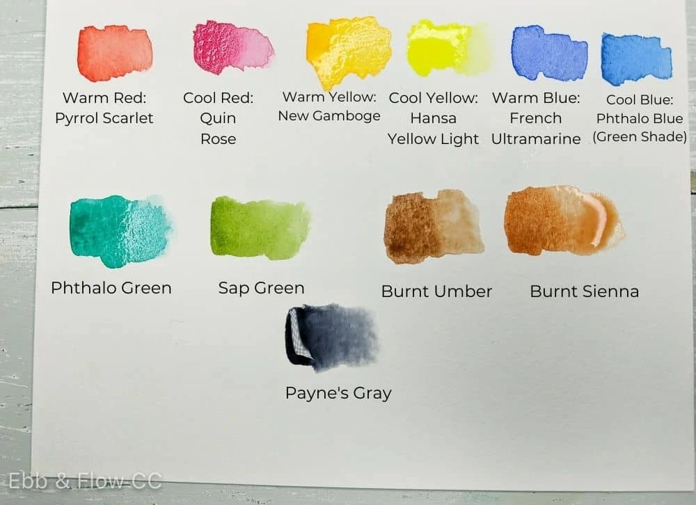
Watercolor Starter Colors
When you first start painting with watercolors, it can be hard to know which watercolor colors to buy.
My recommendation is to buy basic watercolor palette colors: primaries plus a green and a brown.
The Basic Watercolor Colors to Buy
When you’re first starting out, you should start with the very basics to learn color mixing.
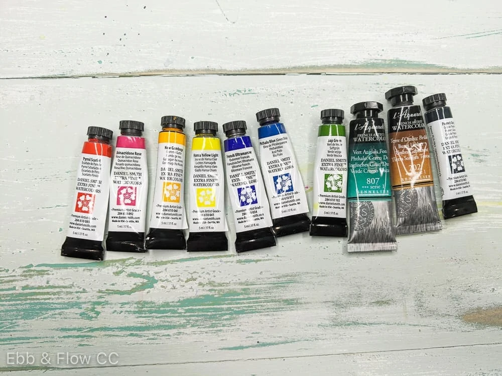
My recommended watercolor palette colors are a warm red, warm yellow, warm blue, cool red, cool yellow, and a cool blue.
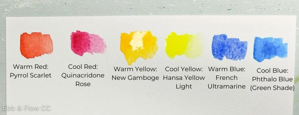
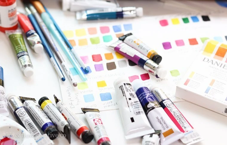
I have this Daniel Smith Essentials kit that contains all of these colors and it’s great for mixing. Daniel Smith paint is artist quality paint and the colors are beautiful.
Other Essential Watercolor Colors
Greens
Although greens are easy to mix, it’s nice to have green in your palette. Just like the primary colors, greens can be warm or cool.
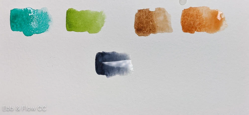
The most popular cool green is called phthalo green. It’s pretty garish on its own, but it’s nice for mixing up teal colors.
The most popular warm green is called sap green. It’s lovely on its own or can be mixed with other colors.
Browns
I don’t paint with brown a lot, but I like having it in my palette to make neutrals or to tone down other colors.
Burnt umber is a nice darker brown that mixes with ultramarine blue to create a perfect dark gray.
Burnt sienna is a reddish-brown color that can be mixed to create skin tones.
Grays
Watercolor palettes often come with white and black, which are pretty useless. Instead, I recommend a dark gray like Payne’s Gray or Neutral Tint. These colors are perfect without being overpowering.
However, if you don’t use this color a lot, it’s easy to make with burnt umber and ultramarine blue.
White isn’t generally used in watercolors because you simply dilute the colors to get a lighter color. Adding white to a color increases the opacity of the color and makes them a bit chalky.
The Best Watercolor Palette Colors
Other Considerations for Choosing Colors
Subject Matter
You should also consider the subject that you like to paint. Landscapes will need more blues, greens, and browns. Florals will need plenty of pinks, reds, purples, and greens. Portraits need yellows, pinks, and browns.
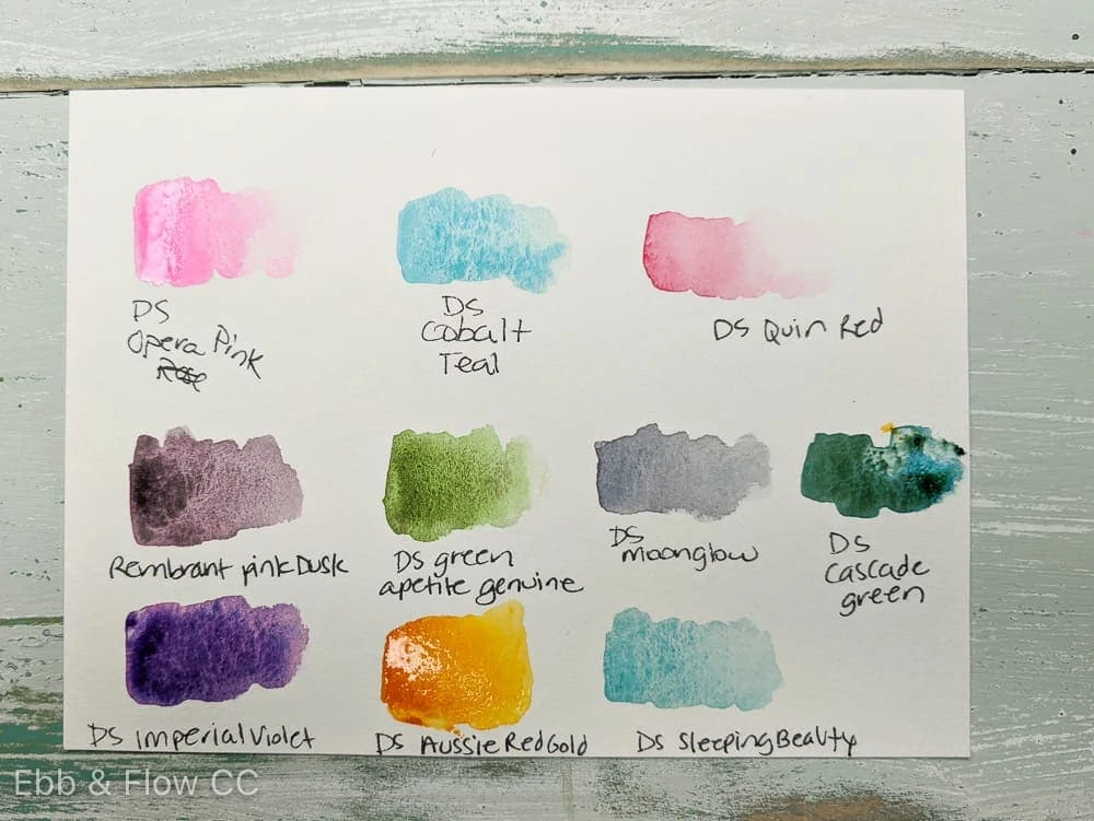
If you paint a variety of subjects, it’s nice to have a variety of colors. In addition to the main colors listed above, I like to add a pale yellow like Naples Yellow and a purple like Imperial Violet. I don’t love purple, but it’s perfect for adding shadows.
Convenience Colors
If there’s a certain color that you find yourself mixing a lot, save time with a convenience color. For instance, I found that I was always mixing dark gray, so I bought myself a tube of Payne’s gray to save me time.
Fun Watercolor Properties
Another thing to consider is that certain watercolor colors are just fun to work with. Some colors have special properties that do fun stuff like granulate or separate into different colors. Daniel Smith colors are well known for these properties.
Colors You Love
The last thing to consider is adding colors that you love working with. Turquoise is easy to mix, but I love using it, so I own several versions.
Opera Rose gets a lot of hate in the watercolor world because it’s not lightfast, but there’s no other pink like it, so I keep it in my palette.
No matter which paint colors you choose, keep in mind that you can add more colors as time passes. It’s one of my favorite parts of painting with watercolors: collecting new paint colors!
What are your favorite must-have watercolor starter colors?
You Might Also Like:
- Watercolor Paper for Beginner
- How to Use Watercolor Pencils
- The Best Watercolor Palettes
- Watercolor Gifts to Give
- The Best White Pens for Watercolors
- How to Use Watercolor Tubes
Pin for Later!
Extremely helpful. Exactly the content I was looking for, thank you for your thorough explanation on the colors and why you chose them, and your suggestions on which colors to get. I really appreciate it.
I love this website but hesitate to signup for your newsletter as I protect my email from being sold to anyone. Then I get a lot of spam.
Hi Kerry,
No worries, although I don’t sell email addresses. Spam sucks and I would hate to contribute to that. Feel free to bookmark my site and check back every now and then for new posts. 🙂