How to Paint White with Watercolors

I’m a self-taught artist who loves sharing tips and tutorials for painting with watercolor and gouache, and using the Procreate app on the iPad.
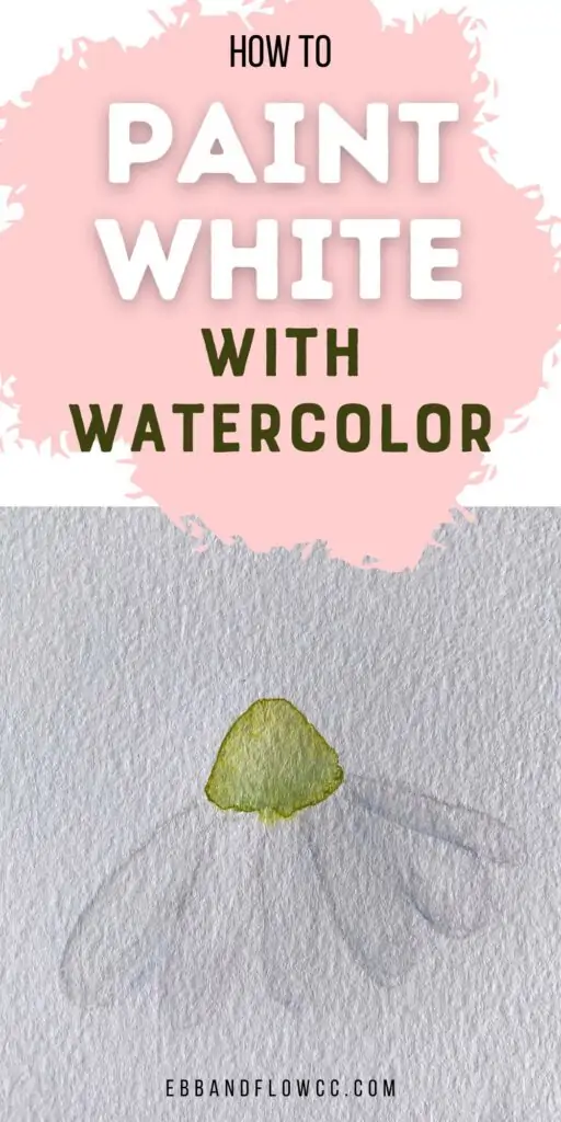
Learn how to paint white with watercolors. Due to the transparent nature of watercolors, painting white objects can be difficult at first. Here are my best tips to get started.
You might also like these other watercolor tutorials for beginners.

This post contains affiliate links. By purchasing an item through an affiliate link, I earn a small commission at no extra cost to you. As an Amazon Associate I earn from qualifying purchases.
Painting white with watercolor paint is one of my favorite things to do. I love mixing very pastel colors and creating barely-there artwork.
How to Paint White with Watercolors
Usually, in watercolor, you leave open spaces to show white. However, there are some objects that are completely white and need details to make sense.
One option is to use ink to create linework. This works for illustrative pieces, but it’s not right for everything.
The other solution is to use color to create depth and shadows.
Here are some tricks I use to paint white.
- Use paint to show edges and shadows for white objects.
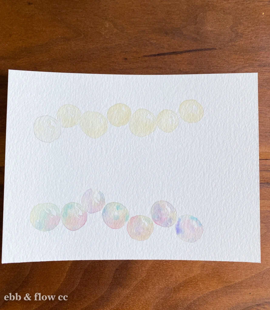
- Dilute paint to create pastel watercolor colors. I like to use an eye-dropper to get enough water into my mixing area.
- Paint the outside of the shape and use a damp brush to soften the edge, leaving white space in the middle.
- Paint until your brush runs out of paint. This will vary the tones and create barely-there color. If it’s too light, you can add another layer.
- If you add too much paint, use a damp brush to lift the excess paint color off of the paper.
- You can also paint with clean water and let the paint from another spot flow into the water.
How to Choose a Paint Color for White
Choosing the right paint color for painting white is really fun. You can go for a realistic look or you can use some artistic license and get creative.
Here are a few things to keep in mind when choosing colors to represent white.
Don’t Use White Watercolor Paint
White watercolor paint on its own is pretty worthless. It doesn’t really show up and it lacks the depth that you get when you use colors.
White paint has a purpose, but it’s not to be used on its own. Rather, it can be nice to create opaque pastels, especially for florals.
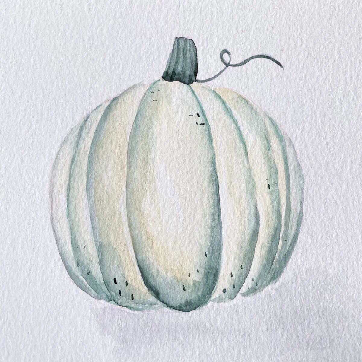
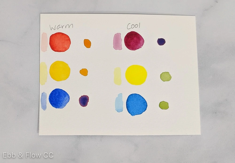
Look for Color Undertones
Few things are true white or true black. Most objects have color undertones.
For instance, my dog is a black lab, but she has warm undertones in her fur. Snow has blue undertones when the sun hits it.
If you’re having trouble seeing the undertones, look at it in daylight. Another trick that helps is to hold a white piece of paper next to it.
Use Complimentary or Analogous Colors
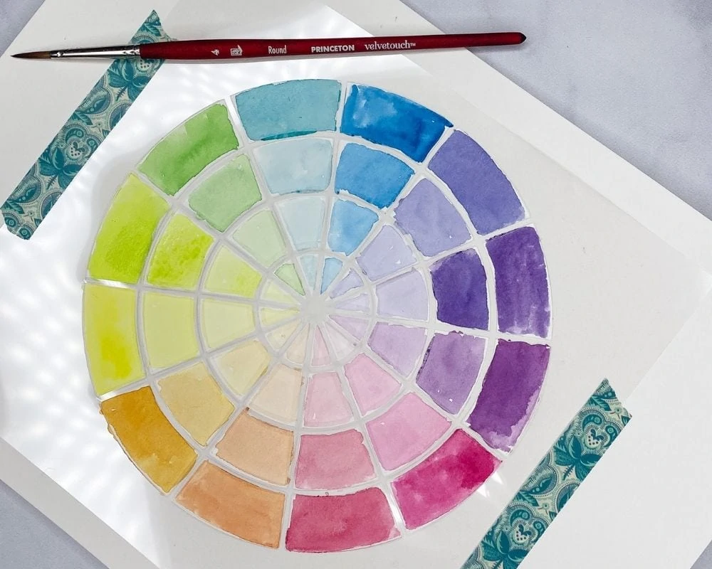
You can also use complementary or analogous colors. (If you need more information on this subject, I have a post on color theory here.)
Analogous color schemes are very soothing to look at, whereas complimentary color schemes feel bolder and more exciting.
For instance, if I wanted to paint a white cat with blue eyes, I might use diluted orange or yellow-orange for my shading. (This will also make the painting feel warm and cozy, which we will cover in a minute.)
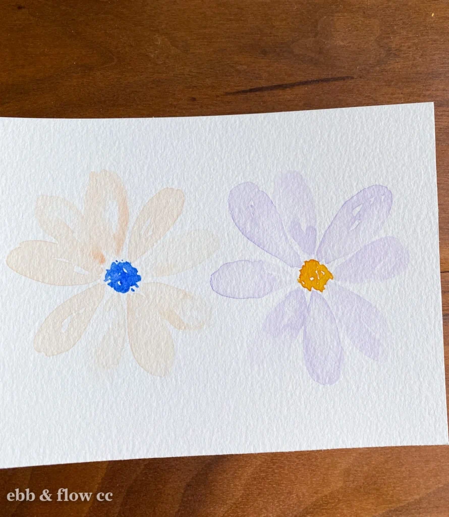
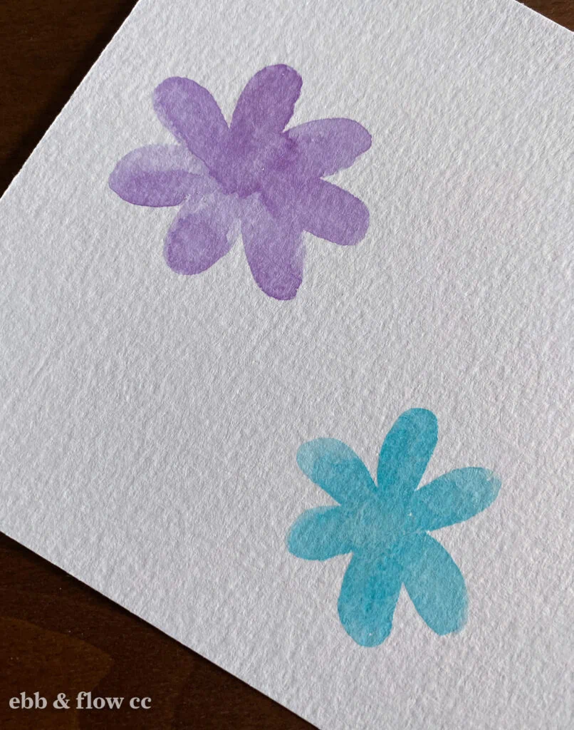
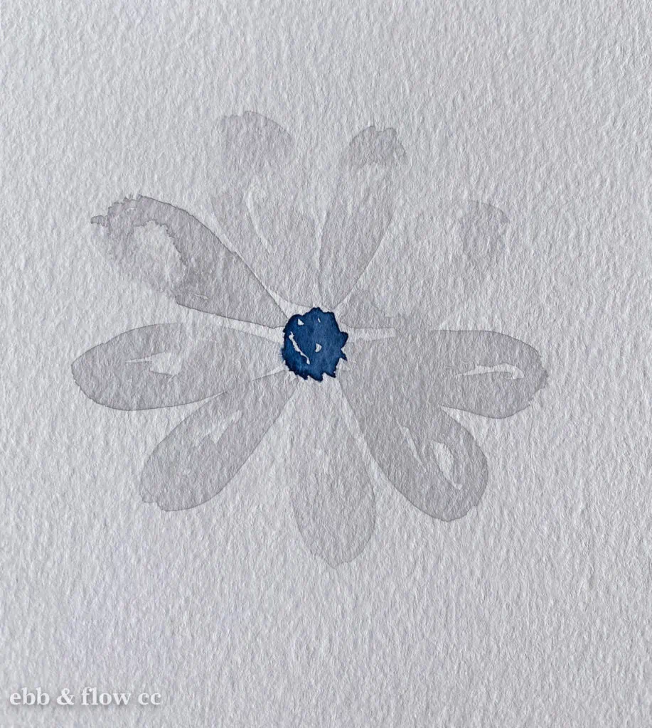
Daisies are one of my favorite things to paint and I often use yellow or green because the centers are a yellow-green color.
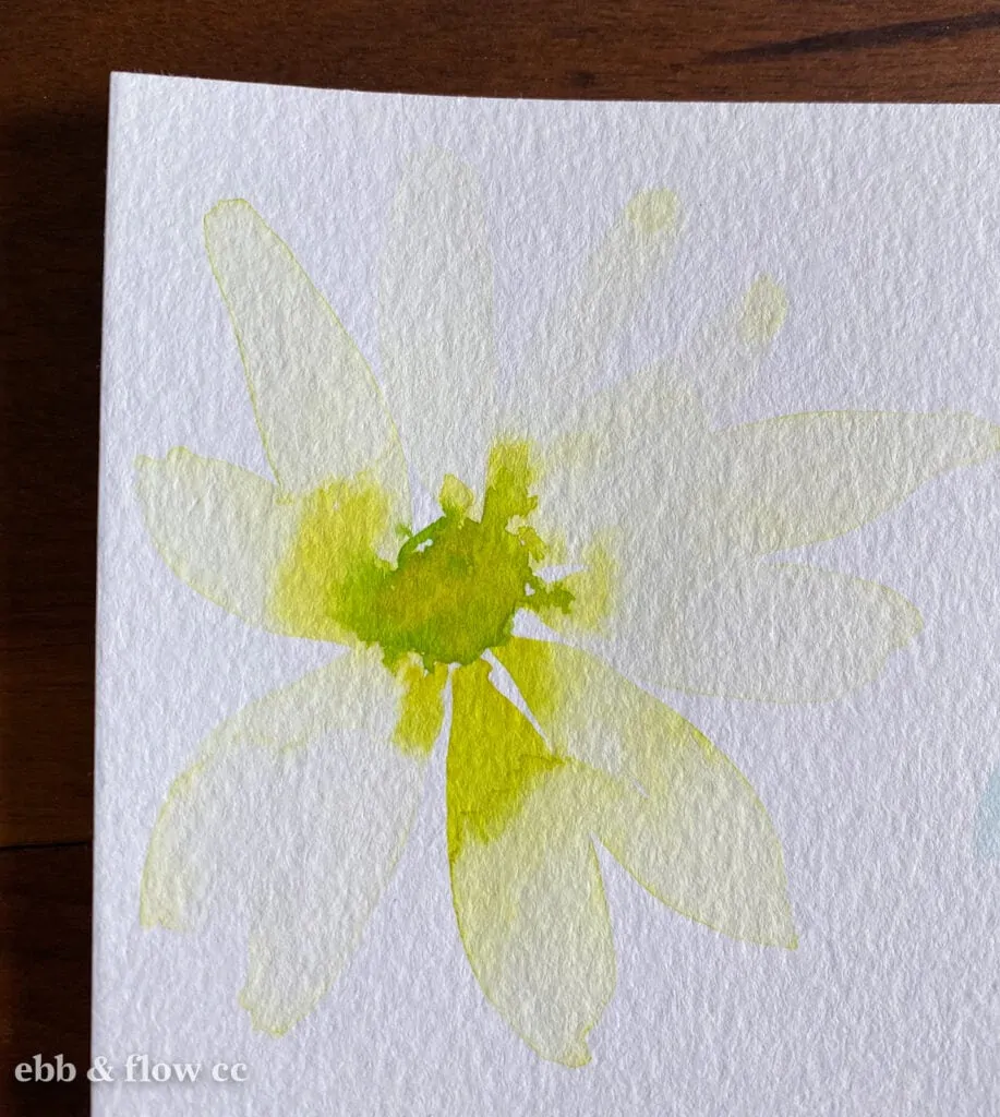
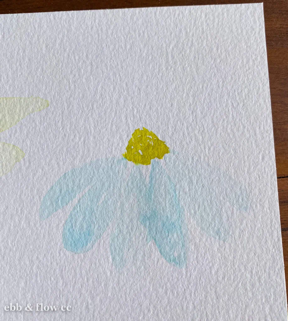
Using the daisy example again, I also like to use aqua for the petals since the centers are yellow and the leaves are green.
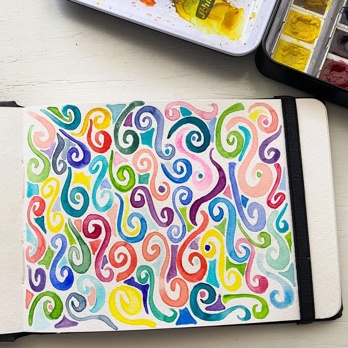
Use Colors That Are Used Elsewhere in the Painting
Using colors that are used somewhere else in the painting can create a cohesive feeling.
In this painting in my sketchbook, my daisies are aqua and so is the mason jar.
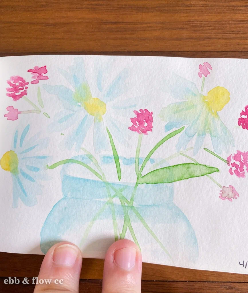
(By the way, this is a good reason for keeping a sketchbook: while looking through my old sketchbooks for this post, I realized how much better I’ve gotten at painting.)
Use Colors to Evoke Feelings
You can also use colors to evoke feelings. Bright colors make you think of excitement. Dull colors can be depressing and somber or moody and cozy.
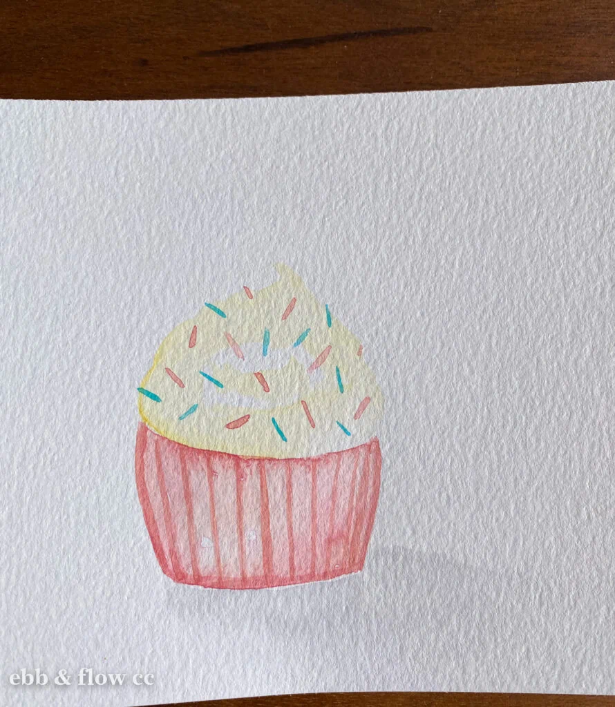
For this cupcake, I used a creamy yellow color for white icing. The creamy color reminds me of vanilla and the happy memories of birthdays.
For pearls, I can paint them in warm colors to evoke warmth and nostalgia or pastels to evoke femininity.
Colors can also convey temperature.
I painted these birds with pinks and yellows to show warmth since they are tropical birds.
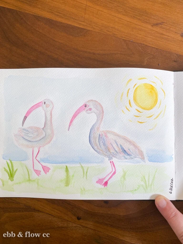
This is also an example of using colors that are elsewhere in the painting. (The bird’s legs and beaks can look pink in real life, so I painted them pink.)
If I had painted the birds with diluted black or green, they may look sickly and sad.
Use Diluted Black
If all else fails, you can use a diluted black or another dark color. I like using Payne’s gray or mixing my own blacks to get a more interesting result.
Indigo is also a nice color to use.
Avoid Colors with Bad Connotations
Don’t use colors with bad connotations.
For instance, yellow snow would be bad. A green cat would feel weird. Green on food would look sickly.
Ready-Made Colors That Can Work
There are a few colors that work well for painting white, straight from the tub or pan.
I really like buff titanium and Naples yellow for painting creamy whites. They still need to be diluted, but they work well.
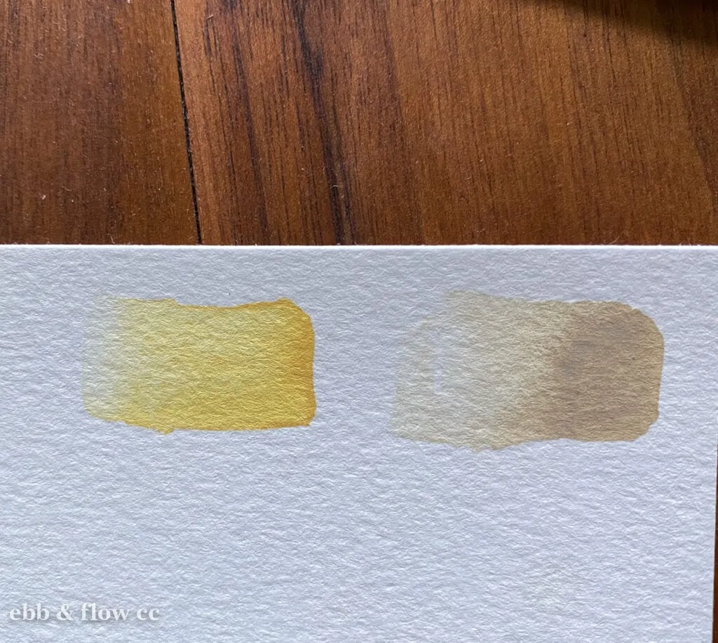
Both paints contain white, so they are a bit opaque. Be sure to dilute them to get more transparent versions.
Using Watercolor Pencils to Paint White
Using watercolor pencils is a really easy way to control how much pigment you’re adding.
Draw the outside of the object and use a damp brush to paint along the edges.
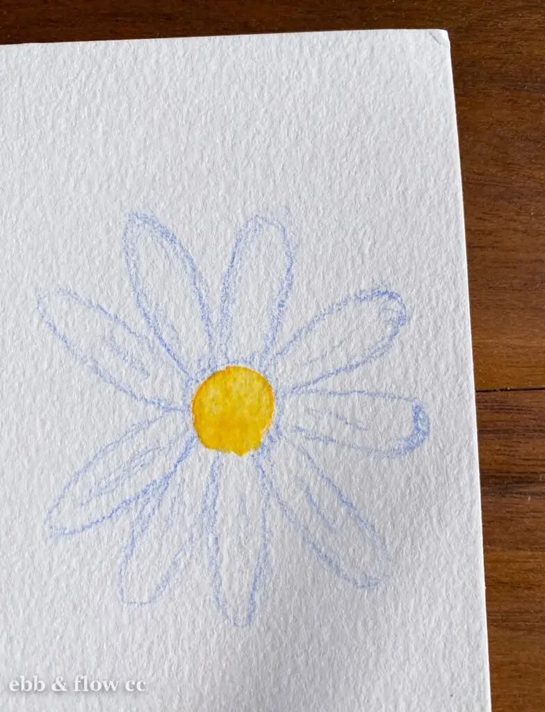
The more pencil you add, the darker the paint color, so go sparingly.
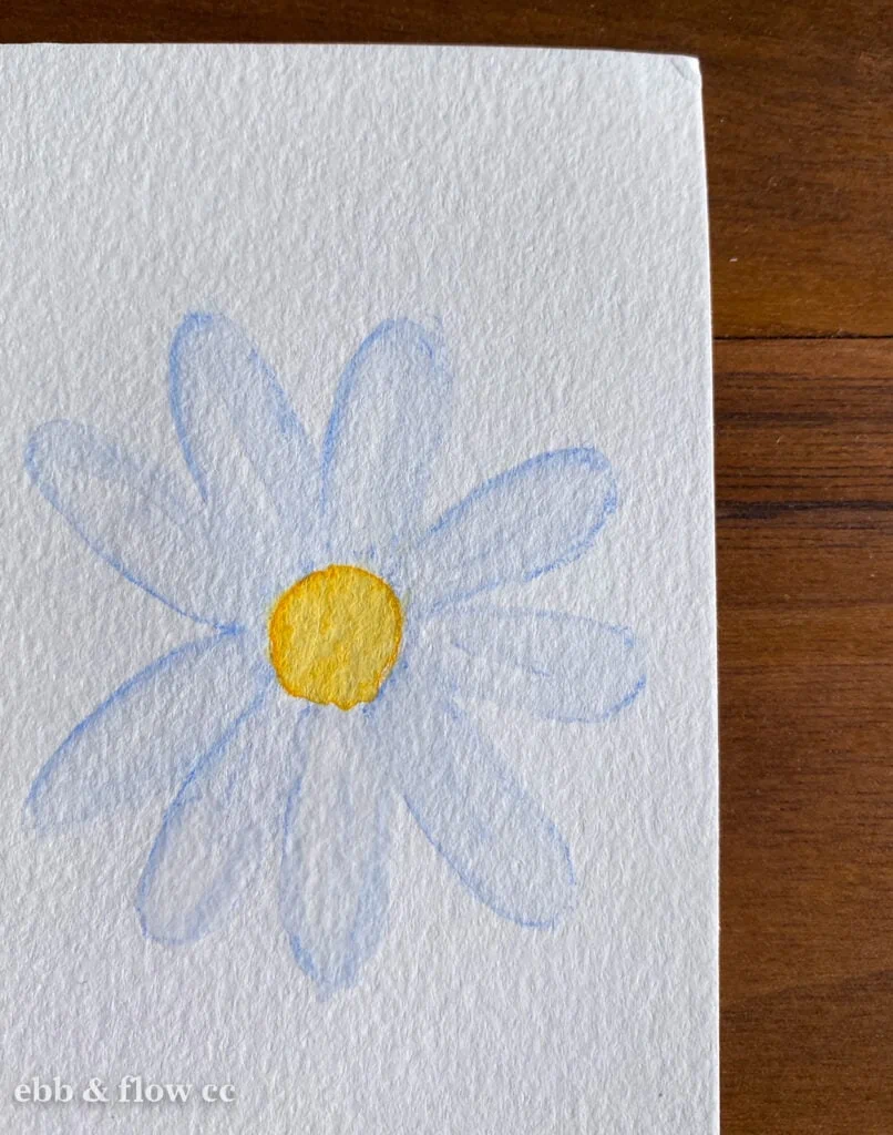
Using high-quality watercolor pencils will ensure that your lines blend out with water.
Paint the Background Instead
I’ve been trying out this new technique and loving it. Sketching it out first and then painting the background will yield more accurate results.

However, I also love painting freehand. The results are wonky, but I kind of love how it looks. Mistakes can become shadows. Just add another layer to the background to clean up your lines.
Add details with the background color.
Using White As Accents
I’m a huge fan of adding white accents to my art, but I still don’t use white watercolor for this. It’s too transparent. Instead, I use white ink or white pencils.
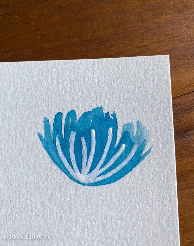
I used a Posca pen for this example.
You Might Also Like:
Pin for Later!